Pentagram designs identity and packaging for Liberty fragrance range
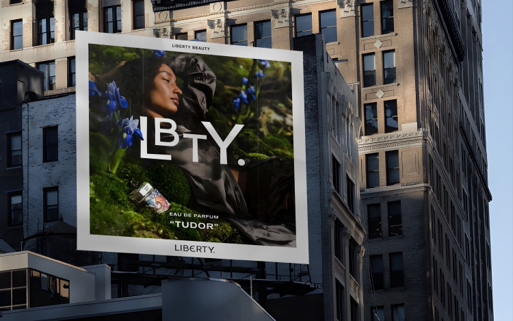
Inspired by the discovery of “typographic shorthands” in the Liberty archive, a new LBTY logotype was designed to adapt the main Liberty identity.
Pentagram partners Harry Pearce and Jon Marshall have designed a new beauty brand for Liberty, which is launching with five gender-neutral fragrances and packaging featuring archive-inspired prints.
The fragrance collection is the first release from Liberty’s new LBTY Beauty range. Each one has been created by a selection of renowned perfumers, jointly responsible for scents such as Le Labo Santal 33, Tom Ford Black Orchid and White Patchouli, Glossier You, and YSL Black Opium.
Pearce and his team were approached in 2022 to help Liberty extend into the luxury beauty market, as they had previously created the visual identity for Liberty in 2020 and, more recently, had extended that identity into a series of typographic fabric patterns.
Pearce explains how the naming process began with “archival research”, during which the team discovered that Liberty had been shortened to LBTY on “hallmarks” and other applications. Expanding on the “visual language of the business” designed in 2020, Liberty Beauty’s typographic logotype features letterforms taken from the main Liberty logotype, Pearce adds, which was created from the lettering in the original sign above the Great Marlborough Street storefront.
Each fragrance is contained in an “elegant clear glass bottle with an understated black and white label on the front”, says Pearce. Akzindenz Grotesk Extended is used on the labels, nodding to “indexes of trademarked fabric names found in the Liberty archive”, he adds.
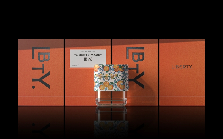
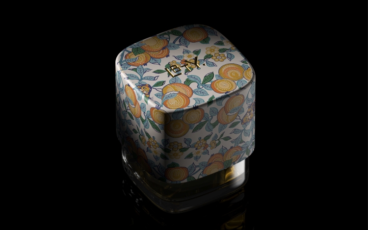
Oversized lids showcase a Liberty print – chosen to represent each fragrance – and feature a gold debossed LBTY logo while the “pared-back” boxes are made from colour-saturated uncoated paper and feature a foiled LBTY logotype, according to Pearce.
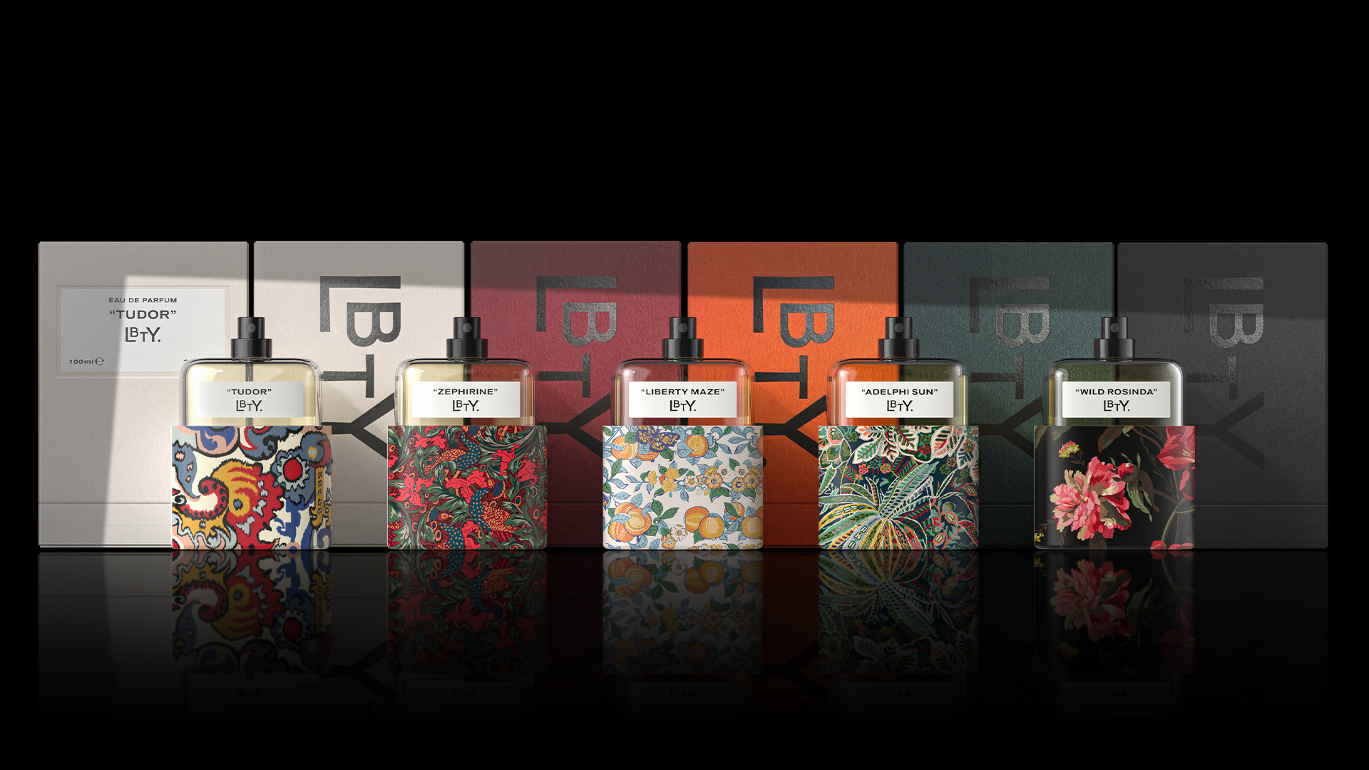
Different perfumers were responsible for each of the scents. Housed in the “putty-coloured” box is the Tudor fragrance, created by Pierre Negrin and inspired by the “vast, richly textured Merchant print tapestry hanging off the beams of Liberty’s flagship store”, Pentagram reveals. Zephirine, by Frank Voelkl, comes in a claret box, with patterns inspired by Liberty’s Eden’s Awakening print.
Read more: Pentagram’s “forward-thinking” new brand identity for Liberty
Created by Hamid Merati-Kashani and Honorine Blanc, Wild Rosinda takes inspiration from Liberty’s Decadent Blooms print and has an ebony-coloured box, while Liberty Maze, by Gabriela Chelariu, invokes Liberty’s heritage Orchard print, paired with a burnt orange box, according to Pentagram.
The Adelphi Sun fragrance draws on Liberty’s Adelphi Voyage print, has a racing green box and was created by Hamid Merati-Kashani.
Read more: Dad rebrands digital perfumery avoiding “generic elegance” of other fragrance brands
Pearce identifies one of the project’s challenges as “building a consistent visual language across so many substrates” while maintaining “such a high quality of finish”. With the perfume bottle design, Marshall says that one challenge was developing “a recognisable branded design without custom tooling for the glass bottle”.
The final design features a custom oversized cap that covers most of the bottle including the label, “maximising the area available for the Liberty print”, he explains. The lid can also be turned upside down and used as a stand for the bottle, providing a” unique identity” for the fragrances and hinting at “an overall design language for future LBTY product categories”, Marshall reveals.

Pentagram says that the boxes were designed to present the bottle in its upright position when opened and use cardboard and paper as the primary construction material while minimising the overall box size.

The Liberty + LBTY logo are simply beautiful.
..The LBTY, it almost resemble the LGBT community.
To propose Liberty if they could make a product range for lgbt…