Pentagram’s “forward-thinking” new brand identity for Liberty
Harry Pearce has designed a new visual identity for the London department store, including a typeface named for the shop’s founder.
Pentagram’s Harry Pearce has designed a new brand identity for Liberty.
The updated branding for the department store includes a new logotype, bespoke typeface and redrawn crest. The design studio says that the new identity “embodies craft, archaeology and refinement” and povides the shop with a “renewed confidence”.

The London store was created by Arthur Lasenby Liberty in 1865. Located on Regent Street, the shop carries a range of items, from homeware to jewellery. It is particularly well known for its fashion departments, with a range of designer labels as well as emerging brands.
Attracting a “new generation”

The new identity had to strike a chord between the store’s history and future, appealing to both heritage customers as well as attracting a “new generation” of Liberty customers.
Pentagram says: “While it references Liberty’s rich heritages, the new identity needed to embody Liberty’s forward-thinking ethos, and take it confidently into its next chapter.”

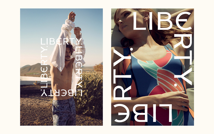
Billed as the “most authentic logotype” in the store’s history, Pearce’s design takes inspiration from the original sign that hangs above the shop’s entrance on Great Marlborough Street.
The logotype is “flexible”, Pentagram says. It can be “repeated, layered and bent to cover packaging and campaigns”. It can also be used as a decorative design in and of itself, transforming into “its own repeat print”.

A “subtler” identity

The Liberty crest has also been redrawn in an attempt to give it a “subtler, modern effect”. The crest and the strapline (‘London 1875’) are being used as brand assets. While they are not part of the brand itself, they can be used “sensitively” to add a “sense of heritage” or “place”. This is especially relevant for the overseas market, Pentagram says.
The logotype has inspired a new typeface, Lasenby Sans, named for Liberty’s founder. It was designed in collaboration with Colophon type foundry. With tapered line endings, and a distinctive epsilon-based ‘E’, the typeface aims to be both “idiosyncratic” and “effortless modern”.

Two supporting typefaces are in use; the sans serif Akzidenz-Grotesk BQ (from Berthold type) and the serif Portrait (from Commercial Type). These typefaces are used for the running text and body copy.
A “cost effective” roll out

Liberty is well-known for its distinctive purple shade, used across carrier bags and merchandise. This has been retained, with a supporting palette of “subtle” gold, black and white.
The identity rolls out across in store and online, from carrier bags to a new website and app. This process will be staggered in a bid for cost effectiveness and sustainability.


-
Post a comment


