Typographic interventions shape “dreamlike” publication for artist Sondra Perry
Fieldwork Facility uses typographic signposting to make visitors “sit up” and engage with the research behind the artist’s work.
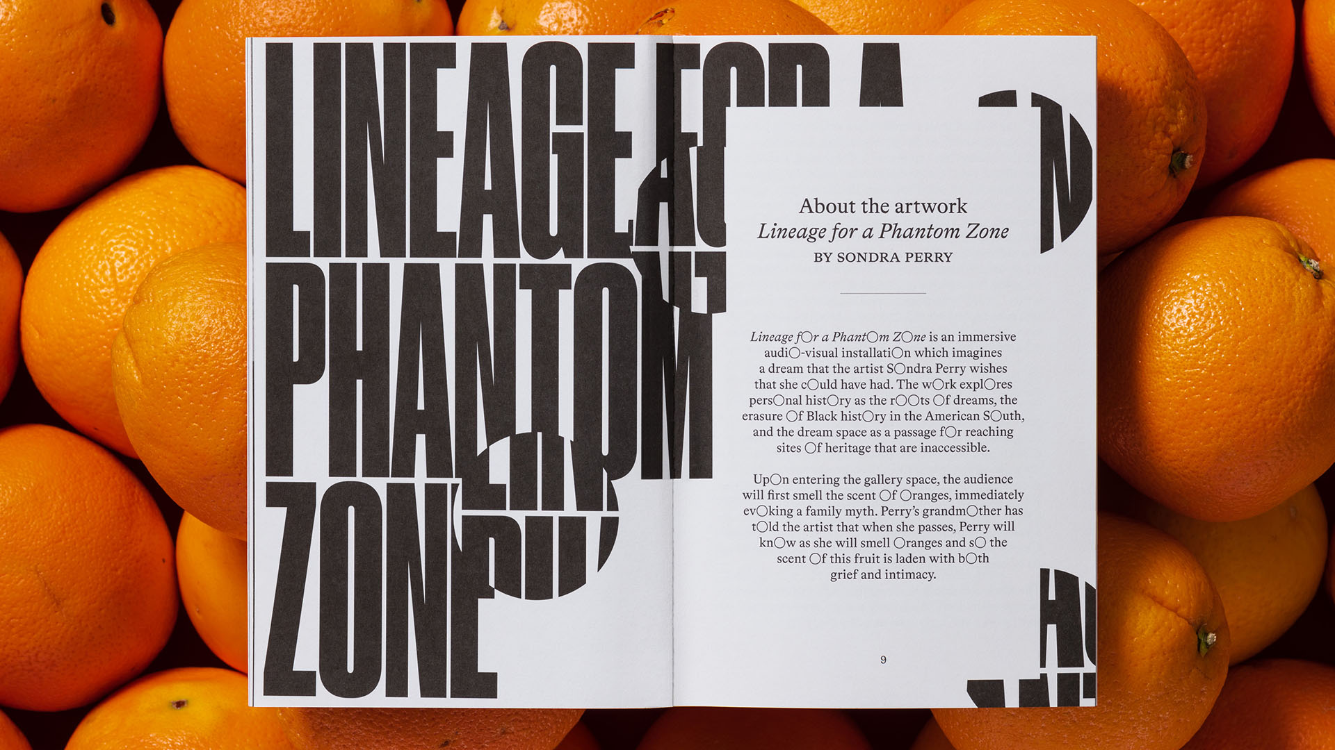
Fieldwork Facility has designed a new “dreamlike” publication featuring experimental typography to accompany American artist Sondra Perry’s audio-visual work Lineage for a Phantom Zone.
Created for the inaugural Muse Rolls-Royce Dream Commission, Perry’s artwork imagines a dream the artist wishes she could have had. Combining personal and online archival footage, Perry explores both her personal history and the erasure of Black history in the American South – considering the dream a space to access heritage that is otherwise inaccessible.
The publication, available for free in the exhibition, invites visitors to delve deeper into the thought behind the work. A Vibe Called Tech, a Black-owned creative consultancy, was commissioned to oversee the editorial, bringing in Fieldwork Facility as designers along with prominent Black writers and artists including Isaac Julien CBE, Kareem Reid, N.K. Jemisin and psychotherapist Bola Shonubi.
“The first conversation we had about the exhibition and [Perry’s] dreams for the book felt like a conversation between old friends,” explains Lewis Dalton Gilbert, creative director of A Vibe Called Tech. “Those we invited to contribute were also people that we felt had deep connections to her practice.”
Robin Howie, founder and creative director of Fieldwork Facility and designer on the project explains how as an artist book, the publication could be “open-ended”, not making sense of everything, but looking to “weave a path” through its diverse range of content.
In the exhibition, Perry’s grandmother is “present” via a pervasive smell of oranges, in reference to a family myth that when she passes, Perry will know from the scent of oranges in the air. Fieldwork Facility desired Perry’s grandmother to have a similar presence in the publication.
“We thought very carefully about how to sensitively translate this to the page without mimicking or taking attention away from the essays and the contributors to the publication,” Howie says.
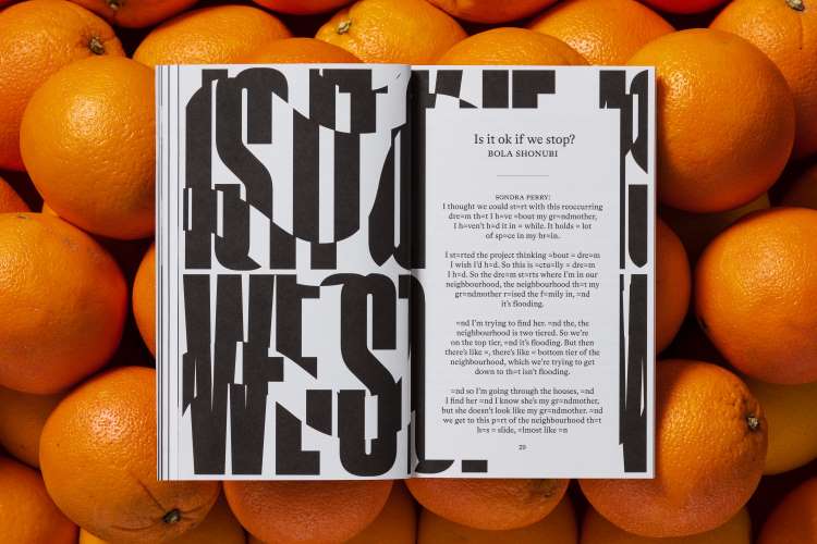
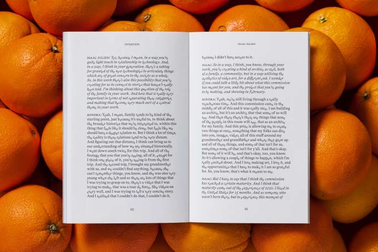
The decision was taken to “add a dream-inspired layer, primarily through [the publication’s] typeset”, Howie says. Conceived of as dream sequence, a series of typographic interventions across seven texts spell out the word ‘oranges’, affecting each of its letters in a different way, inspired by dream phenomena.
Some of these related directly to the artwork, such as the letter ‘r’, which used upside down, mirrors the inverted Cyprus trees that appear in key parts of Perry’s film.
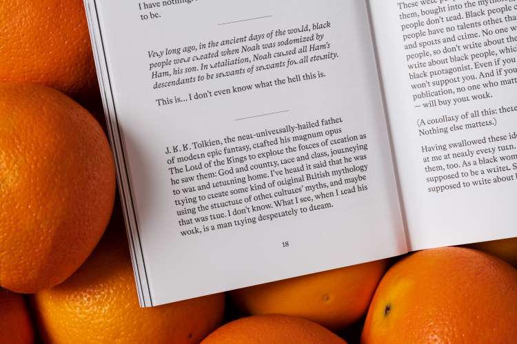
The letter ‘a’, meanwhile, is replaced with ‘≈’; in a conversation with psychotherapist Bola Shonubi, Perry discusses a recurring dream in which a flood occurs, and Perry sees someone who is her grandmother but doesn’t look like her. Both elements are combined in the ‘approximately equal to’ symbol, which is representative of her almost-grandmother but is also like the cartographic symbol for water, Howie explains.
Other interventions play with common dream phenomena. The letter ‘g’ is stretched horizontally to represent “how physics can go out the window in a dream”, while the sensation of falling is translated to one text by the letter ‘e’ seemingly tumbling down below its correct place.
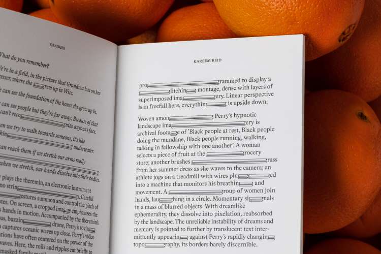
Despite recognising the fun of developing these interventions, Howie says, it was important to not be “graphic for the sake of being graphic”. Instead “you might get through the first essays and think that there were printing errors, but by the time you get to the third essay you are seeing something unusual, a little bit out of place”.
This helps to keep the reader on their toes, he suggests. “You begin to sit up a little bit more and pay closer attention to what you are about to experience”.
While the typographic interventions are bespoke, two existing typefaces are used: Druk for front cover and chapter title pages, and Bradford for the body text. The choice of the latter, published by Swiss type foundry Lineto and designed by Swiss designer Laurenz Brunner, was reflective of the exhibition and publication’s debut at the Fondation Beyeler in Switzerland.

The heart of the design is its typographic interventions, but other elements also link back to the exhibition themes. The cover uses a close-up photograph of an orange, but this is shifted to purple to “set the tone of something [being] not quite as it seems”, Howie explains.
The form of the publication, printed by Bruges-based Die Keure, was also important. Howie wanted to create a novel-like environment for the book’s ideas by designing it to look like a pulp paperback. Then, he explains “as you turn the pages, it becomes subverted”, ultimately becoming surreal, “as a great dream can”.
All images by Ed Park.
-
Post a comment
