Lukecharles overhauls Cats Protection identity to bring “authority” to the brand
An “elegant feline form” has been incorporated into the wordmark while “unique feline touches” feature in the bespoke headline font.
Design studio Lukecharles has devised a new brand identity for UK charity Cats Protection, establishing its “warmth and authority” with bespoke typography and an ownable colour palette.
Since its founding in 1927, Cats Protection has worked to rescue and rehome stray, unwanted or homeless cats while educating people about cats and cat welfare. Lukecharles felt the brand had “so much untapped potential” and saw an opportunity to “modernise” and showcase its “scale and expertise”.
Cats Protection’s strategy was devised to change people’s “understanding of and attitude towards cats”, urging them to learn more about what the charity does so they can support it and use its services, says Lukecharles brand strategy director Rebecca Walton. The charity’s goal is to “promote positive relationships between cats and people” through its brand, “preventing cruelty and mistreatment and reducing the need for rehoming” while also sharing research to influence policy, she adds.
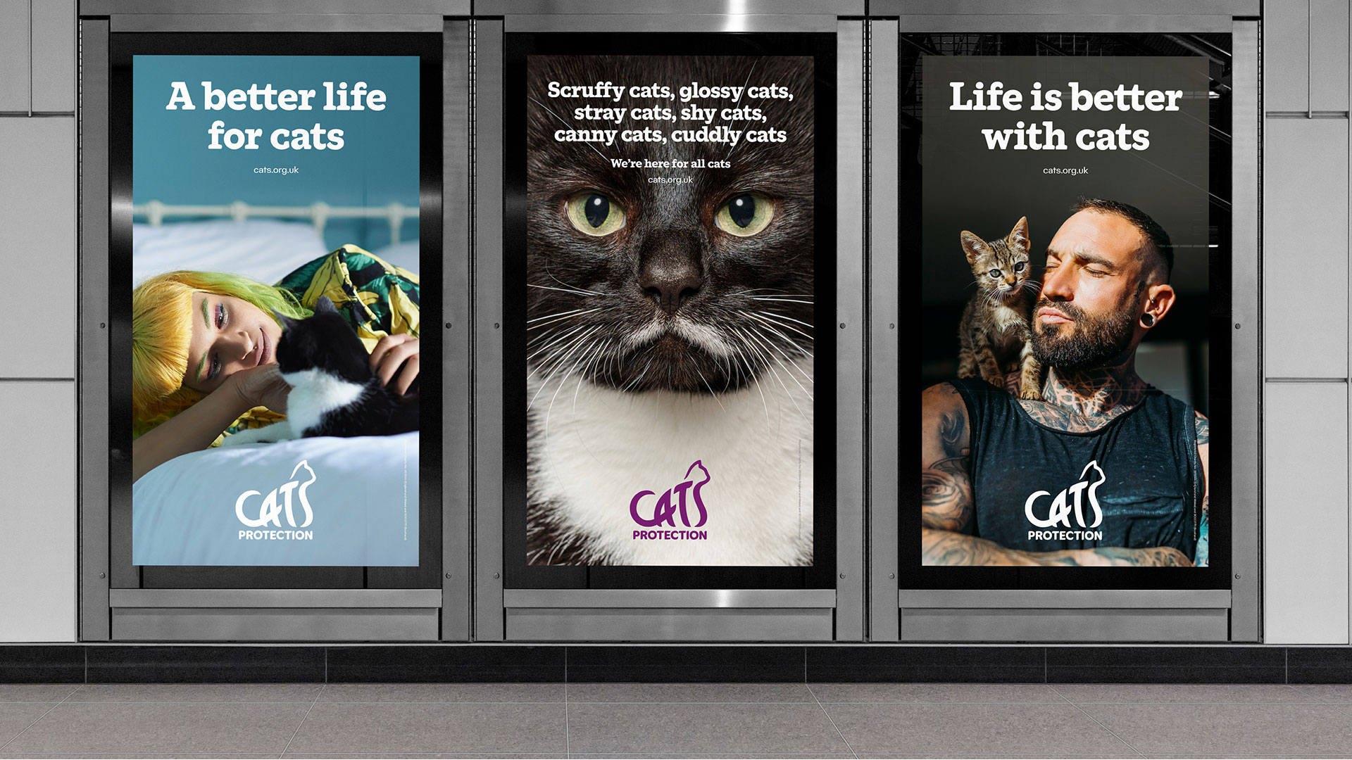
Revising Cats Protection’s messaging was crucial, as it had become “confusing”, according to the studio. Its new brand language centres around the phrase “making a better life for cats, because life is better with cats”.
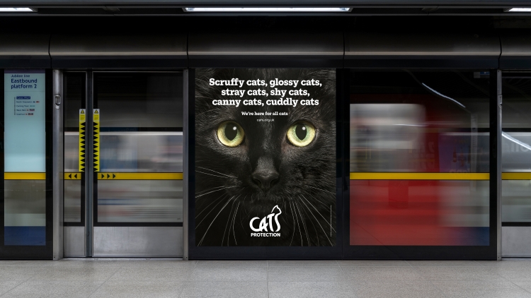
Lukecharles worked with the charity to develop a longer supporting narrative, including “a core paragraph or elevator pitch” and a more detailed set of messaging to be used across communications, says Walton. She explains how tone of voice guidelines were built based on the brand’s personality and new “authoritative positioning”, which invovled “moving away from clichéd cat puns” that came across “amateur or childish”.
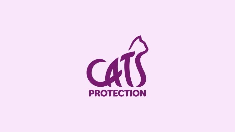
The logo design was inspired by “the dynamic elegance of the feline form”, according to the studio’s creative director Luke Gifford. Merging the form of the cat into the wordmark creates “an indivisible link with the charity’s cause and delivers an instant connection with anyone who cares for cats”, adds creative director Charles Taylor.
Recommended: Battersea Dogs & Cats Home reveals “honest” rebrand by Pentagram
Cats headline is a bespoke slab-serif designed to be the charity’s headline typeface in collaboration with NaN type foundry. It seeks to balance “warmth and expertise”, as the charity is already perceived to be a “caring brand” but needed some added authority given its new strategy, says Gifford. Taylor notes that the font’s “unique feline touches echo the elegance and playfulness of cats”.
Gifford and Taylor thought that the brand’s previous colours, yellow and blue, were too “heavily used” within the animal welfare sector and so Cats Protection needed a new lead colour to differentiate it. Cats Protection Purple was chosen to convey “the sophistication of cats” and the charity’s “warmth and authority”, as with the new typography, says Gifford.
The supporting palette, which Taylor describes as “intentionally limited”, comprises several purple hues. He says the charity was previously using a lot of different colours in communications, making it not “easily recognisable as Cats Protection”, whereas the new approach “will help them stand out and build strong brand associations”.
One challenge was reevaluating Cats Protection’s use of imagery, according to the studio. In the past, Gifford says it had “struggled to identify a strong and distinctive photography style”, which made the brand feel “disjointed”. Lukecharles recommended a range of photography approaches suitable for different purposes, “from fundraising to advice and education to campaigns”, says Gifford. To support the photography, the studio also developed “a consistent and ownable illustration style which delivers a more sophisticated take on the feline form”, he explains.


Nice homage to the old classic Spratts pet food logos. There were 4 in all The terrier dog (most recognisable one), cat, Budgie and a fish.