Battersea Dogs & Cats Home reveals “honest” rebrand by Pentagram
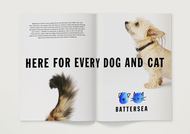
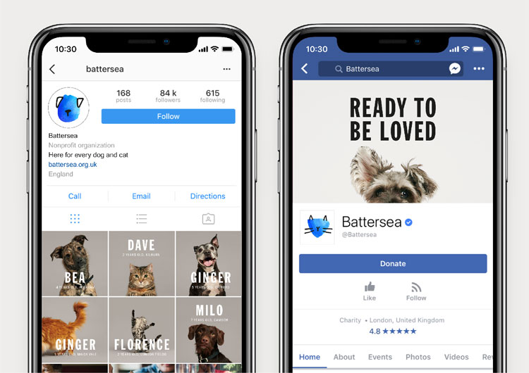
The animal charity has been renamed simply as Battersea, and its new identity features playful, watercolour illustrations that depict different breeds of cats and dogs.

Animal rescue charity Battersea Dogs & Cats Home has unveiled a new visual identity and brand strategy, which have been developed by Pentagram partners Marina Willer and Naresh Ramchandani.
The animal welfare charity was founded in 1860, and now has three rescuing and rehoming centres for cats and dogs around the UK.
Pentagram was commissioned to develop a new identity and brand strategy for the charity.
“Despite Battersea’s longstanding pedigree, an inconsistent approach to identity and communications had left it with a brand that did not convey the full breadth of its offering and expertise,” says Pentagram.
Battersea’s new identity sees “Dogs & Cats Home” dropped from its name, in order to avoid confusion about the charity being a permanent “home” for animals, and to emphasise the fact that it is based in more than one location.

The new identity aims to portray Battersea as both a “compassion caregiver” and an “authority in animal welfare”, says Pentagram. A series of hand-drawn watercolour illustrations of dogs and cats have been created by illustrator Hiromi Suzuki, which appear in the charity’s signature blue brand colour.
The illustrations look to appeal to people’s compassion, says Pentagram, without victimising the animals that the charity looks after. “While the characters are devoid of facial features, they remain expressive and retain a strong sense of individuality,” adds the consultancy. “[They celebrate] the diverse range of personalities found among Battersea’s dogs and cats, while emphasising the human intervention required to make them whole.”
The watercolour logo is accompanied by the tagline: “Here for every dog and cat”, which appears in typeface Franklin Gothic to emphasise the charity’s “authority”, says Pentagram. The consultancy has also created a “fun”, hand-drawn typeface called Battersea Paws to use across various applications.
The new tone of voice avoids “shock tactics” and “overly-sentimental” wording, adds Pentagram, instead using “honest” and “straightforward” language across its communications.
Battersea’s new identity is rolling out across all touchpoints.


Unique and playful. The idea of stepping away from the ‘unhappy’ aspects / circumstances surrounding why animals come into care and are in need rehoming sets them up simply as happy healthy animals that are keen for a new home. Lifts the pressure of sorts around the act of adopting animals.
Completely agree, I think with so much sadness in the world, people were becoming a bit desensitised by images of sick, un-cared for animals. I think the positivity in this campaign.
A lovely, fresh, playful identity. Very positive and emotively right on the (slightly wet) nose.
And how much of the public’s donations were spend on this I wonder?