Girlguiding’s biggest rebrand for 113 years launches
Landor & Fitch has overhauled the identity of the UK’s largest youth organisation dedicated to empowering girls.
Design consultancy Landor & Fitch has created a new identity for Girlguiding, the UK youth organisation covering Rainbows, Brownies, Guides and Rangers.
Launched to coincide with International Women’s Day 2023, it is designed to help the organisation reach the next generations of girls and volunteers, and support its mission of helping girls “know they can do anything”.
The rebrand is the culmination of several years of change for the organisation. In 2018, Girlguiding sought to modernise with an overhauled programme of badges and activities – covering subjects such as coding, human rights and inventing, with new badges designed by branding studio Red Stone.
In 2019, the organisation started working on plans to refresh its brand in line with the new programme. According to a Girlguiding spokeswoman, as the organisation has “been creating unforgettable empowering experiences for girls for over a century”, there was a need to “address outdated perceptions holding us back”, with the aim of reaching “even more girls and volunteers”.
Landor & Fitch was appointed in 2021 with a brief to create an identity drawing on Girlguiding’s history, while making the brand relevant for present and future generations.
The rebrand was informed by research by Girlguiding, Landor & Fitch and research agency The Nursery that included speaking to members, volunteers and the public across 1000 interviews, explains Landor & Fitch design director Sarah Bustin.
The research highlighted that raising awareness was “an essential improvement area”. Recognition of the different brand logos varied greatly, with only Brownies’ being highly recognised – by 80 % of respondents – while only a third (33%) knew about Rangers.
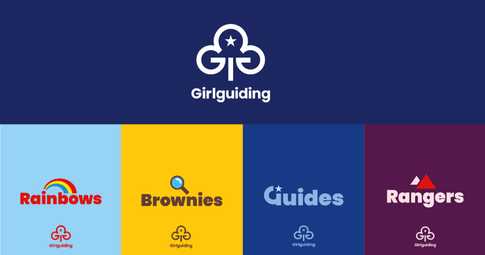
The new identity spans the whole of the organisation’ sections for age groups from four to 18, creating consistency under a Girlguiding masterbrand.
“When refreshing different aspects of the Girlguiding brand, we were mindful not to change what made it iconic in the first place”, Bustin says.
The trefoil logo at the heart of the masterbrand has been retained but refreshed, she explains.
“The new trefoil has all the elements that make it Girlguiding – the three leaves, the star and the flame – with a fresh, white-led colour palette”, Bustin says.
“Take a closer look and you will see that the trefoil is formed around the shape of two hidden Gs”, she adds.
Bustin says that “clear design guidelines” cover elements such as logos, colour palettes, typefaces and illustrations across the brands.
Each section “will draw from these guidelines but have flexibility to create exciting an engaging design work that sparks creativity an curiosity”, she says.
For example, each brand has a wordmark built using the same typeface, but differentiated by unique elements such as a magnifying glass for Brownies, or mountains for Rangers.
A larger suite of icons – ranging from kites to telescopes – has also been developed for each section, in collaboration with Girlguiding and its members, Bustin explains.
She explains that the icons are designed to “enhance storytelling”, adding that the team aim to “continue developing icons and help girls express themselves throughout their Girlguiding journey in new and exciting ways”.
The colours for Rainbows, Guides and Brownies – with its particularly distinct yellow and brown – have also been retained, but the overall palette has been developed to create variation between the different sections and “showcase modernity and vibrancy” throughout, Landor & Fitch explains.
The research undertaken to get feedback during the process showed that girls, parents and volunteers reacted to the “bold and bright designs and colours” of the redesign, with 83% of volunteers, and around 75% of parents and children stating a preference for the new designs over the current ones.
Commenting on the transformation, Bustin describes it as “one of her most personal projects”, explaining that she and numerous other team members “grew up as Rainbows, Brownies and Guides”, while “some who worked on the project are even still involved as leaders”.
“Redesigning the brand has brought back wonderful memories for us all and the experiences which helped shape who we are today”, she says.
“We’ve used those feelings to guide us with this rebrand and created designs that encourage new possibilities, while fulfilling its purpose that girls can do anything”.
The rebrand has launched across Girlguiding’s website, communications and online shop but the entire roll-out will be gradual, with the design of programme materials to change in 2024, and the uniform not changing until 2026.
Ahead of the launch, Girlguiding revealed the rebrand to its members and published suggestions for related activities to understand the purpose and processes of rebranding – such as drawing and painting for younger groups, to discussing what “personal branding” might entail or developing characters and animations to tell a brand story for older members.
-
Post a comment

