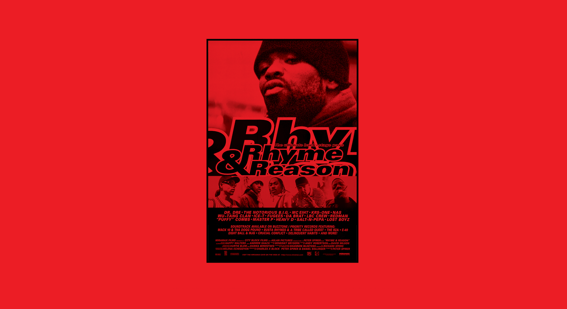
Rhyme & Reason: Jake Noakes talks us through designing hip hop
A new book offers a behind-the-scenes look at hip hop’s biggest artists, just as the genre was breaking into the mainstream.
It goes without saying that hip hop and graphic design go hand in hand. Take the RUN DMC wordmark, for instance: just as with Milton Glaser’s iconic ‘I ❤️ NY’, you can pretty much replace any and all of the letters in the ‘It’s Like That’-creators’ stark black, white and red logo and it’s still instantly recognisable. Indeed, many have done just that. In no-nonsense, all-caps Franklin Gothic, the stacked letterforms look as imposing and slick today as they did when first created by then-in-house designer at Island Records Stephanie Nash, with the logo making its debut on the sleeve for 1986 single My Adidas.
Perhaps more than most other genres, hip hop has always had an affiliation with striking graphics, and with subverting existing mediums and fonts. After all, let’s not forget that one of its most famous proponents, Chuck D, started out as a graphic designer himself. Graduating with a Bachelor of Fine Arts degree from Adelphi University in New York in 1984, two years later Chuck D created the now-instantly recognisable Public Enemy logo by hand.
And where once Blackletter-style typography was seen as the preserve of rock and metal, for instance, countless hip hop artists have since reclaimed it as their own – especially in recent years with the likes of Hassan Rahim and his designs for Jay-Z adding a post-ironic slant to the formerly goth-leaning letterforms.
Even the most cursory glance through hip hop imagery of the past reveals a vast cornucopia of great design, from the flyer graphics to various acts’ and record labels’ logos, to record sleeves and – crucially – the graffiti letterforms pioneered by early hip hop culture.
This is all revealed beautifully in a hefty new tome by filmmaker Peter Spirer called The Book of Rhyme & Reason: Hip-hop 1994–1997. The book presents more than 130 of Spirer’s previously unseen and unpublished photographs taken in the mid-90s while he was undertaking a three-year project interviewing around 80 hip hop artists who went on to shape, as publisher Reel Art Press puts it, “one of the most important cultural movements of the 20th century” and offering “an unprecedented glimpse behind the scenes just as the culture exploded into the mainstream”. Among the artists featured in these images are Chuck D, Tupak Shakur, Kurtis Blow, Dr Dre, Salt-n-Pepa, LL Cool J, Lauren Hill and Jay-Z.
The book takes its name from the documentary film that resulted, Rhyme & Reason. The images within were all shot as accompanying stills to the film using a medium format Rolleiflex camera. “The Rollei allowed me to capture some amazing moments: Puffy getting a trim in his office while doing three tasks at once, Biggie opening record plaques on his couch, Ice-T and Mack 10 hanging with their homies, Heavy D at the barber, playing pool…” Spirer writes in the book.
“I wanted America to have a chance to see the human side of the culture and the people in it. The relationships of artists and their families, friends and parents,” he continues. “I wanted to lower the volume so that we could hear from the artist and get their unfiltered thoughts about life, the biz, their hopes and dreams, and get a real peek into their world. I also wanted to create awareness for this amazing culture and create a historical record of what hip hop was all about.”

With such a rich and revelatory selection of images, clearly designing the book was no mean feat – but it was one pulled off brilliantly by British-born, Amsterdam-based art director and graphic designer Jake Noakes.
Noakes was brought in to work on the project thanks to a longstanding relationship with Reel Art Press: he’d helped out when the publisher was in its infancy, working on the brand identity and designing a couple of its early releases. Noakes was known to be into hip hop, and so was asked if he wanted to turn his hand to Rhyme & Reason.
The brief for the project was “really open”, says Noakes. “Tony [Nourmand, Reel Art Press founder and editor-in-chief] had a hard drive of images that Peter Spirer had given him, he passed those onto me and I was basically given carte blanche to create a book.” Given little to go on aside from the size of the book and the page count the editors wanted to work to, Noakes started out by looking at the image selection and sequencing. “I wanted it to be a companion piece to the film, which is why there are so many quotes in there, in case people haven’t seen the film,” Noakes explains. “I think it’s really interesting to hear what the artists have to say.”
The book, like hip hop itself, is broadly divided into four main ‘pillars’: MCing, DJing, graffiti and break dancing. Noakes’ goal with the cover design was to loosely reference all of these, but with an emphasis on MCing since the majority of the interviews in Spirer’s original film were with MCs. The designer drew on a couple of visual reference points, too: he was captivated by the layout and close cropping from a 1974 cover for Peter Weiss’ book Informes; as well as a Vogue Hommes magazine cover, also from the 1970s, which used a close crop of a mouth with a grill.
Noakes then looked to give the images for the cover a uniform treatment that made them consistent but also “quite grungy because this is the music of an oppressed people and where they came from wasn’t always nice and shiny” he explains. The look and feel was inspired by Merry Alpern’s 1995 photobook Dirty Windows and Trent Parke’s photo series The Camera is God, from 2013. Noakes was taken with the way both works look distorted as a result of blowing the images up, but they remain just about legible. For the Rhyme & Reason cover, however, Noakes says: “I did want the artists to be recognisable so I tried to find a balance between pushing it into abstraction and seeing who the mouth belonged to.”
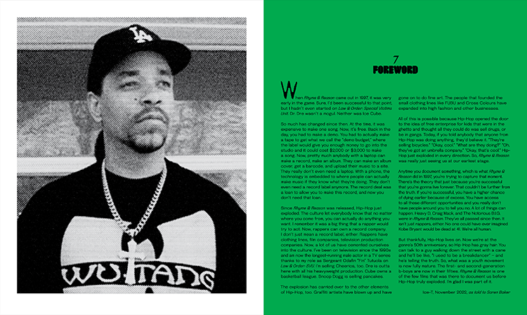
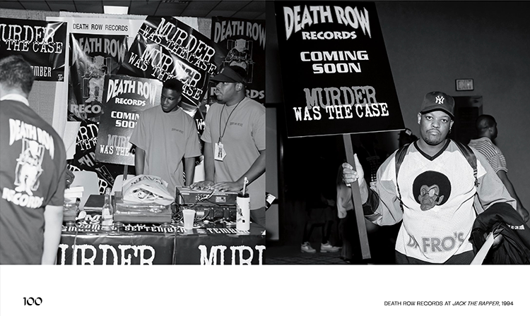
Throughout the book, colour and typography are used to striking effect not just to create layouts that look nice, but to give a sense of pace, rhythm and sense-making. The palette uses colours taken from the Pan African flag, Noakes explains. “Those colours have been used on some classic record covers, like Roy Ayers, Funkadelic and ATCQ, which were influential in the era just prior to the film coming out, with the Afrocentric style of hip hop that I kind of grew up with,” he says. “I used black for the artists who are no longer living and green for those famous for loving the leaf (Cypress Hill) or for making mad money (Dr Dre). The others got red!”
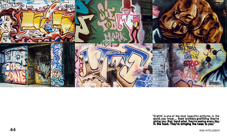
Another of the four pillars, graffiti, directly informed the use of typography in the book. “I’ve loved graffiti forever: to my mind it’s one of the purest expressions of human creativity, often done by people who don’t see themselves as artistic in the traditional sense, and massively underrated,” says Noakes. “But whilst I love graffiti I didn’t want to use tagging style fonts, I wanted some consideration for well-designed type that evokes some of the expression of graf.”
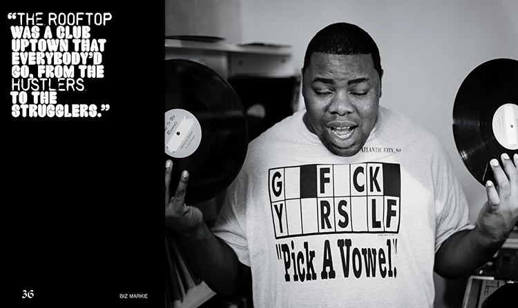
As such, for the quotes in the book Noakes chose Stamp RSPK One by Carl Seal, and Crack by Phillipp Hermann of the foundry Out of the Dark. Of the latter, Noakes says it “looks like it comes straight from throw-ups and those early Seen trains from the late 70s/early 80s – that style is still so popular in today’s graf scene. Crack is a very stylish interpretation of that, beautifully drawn and is very legible as well.” The reason he ended up pairing it with Stamp RSPK was thanks to the font’s similarity to the “photocopied, imperfectly typeset look” of early hip hop flyers shown in the film.
The body copy in the book uses Steinbeck by Temporary State (“it felt a little bit anarchic to me and I think the early days of hip hop had that too,” says Noakes); while the page numbers use Biskops Arno by Martin Frostner and Sueh Li Tan. “There are so many musical styles in hip hop that all come from the same origins and that’s what makes it such an exciting culture. I think the combination of typefaces tries to reflect that – it’s a bit playful,” says Noakes.
The bio page, for instance, uses four fonts at once: “It could be seen as a bit much, but I hope that the typography feels balanced – the large format artist’s quote dominates the top of the page but is given some space between what happens below – the centralised page number and artist name that sit together as a kind of lock up and then the fully justified short text that kind of grounds the whole thing,” says Noakes.
What makes the typographic touches in the book so effective, in part, is the textural treatment they’re given: Crack, for example, is often pushed to the very border of legibility. This is to reference the way that “rapping is so expressive,” says Noakes. “The voice rises and falls, it’s aggressive, funny, weird – all in the same verse sometimes…” He adds that he wanted the blocks of text to be as much “graphic shapes on the page” as they are readable, legible copy.
For Noakes, designing the book was something of a dream in that he got to work with images of some of his favourite artists, which he – nor anyone else – had ever seen before. “Most of the work I make is not really in this space, so one of the nicest things about this project is that I can ‘talk’ to people who also love hip hop and graf,” he says. “The design of this book also needed to be accessible to appeal to a wider audience, but my design choices always started from a love of the culture.”
-
Post a comment
