Five of our favourite fonts from 2023
Featuring out-there designs inspired by spherical marble forms, a stencil font that’s protest-ready, and typography to build chairs with.
From activism-led type foundries and fonts to make furniture with, to lettering inspired by bones and typography that nods to cult Italian horror movies, we round up a few of this year’s best type releases.

VTC Tré by Tré Seals, Vocal Type
We’re longtime fans of Tré Seals’ foundry Vocal Type, which was founded in 2016 alongside the Maryland-based designer’s eponymous studio to create fonts that are a form of activism: seeing a lack of Black designers around him, Seals’ fonts aim to diversify design by bringing a piece of history to the fore that centres a specific underrepresented race, ethnicity, or gender. Previous fonts include Martin, named after Martin Luther King; and William, referencing activist W.E.B. Du Bois.
This year, however, Seals looked to address a question he was asked during a talk: was he an activist, and if so, would he create a font representing his own story?
Realising that his own story is largely hidden unless you attend such an event, he put any concerns about seeming arrogant to one side (for the record, he doesn’t) and set about creating VTC Tré.
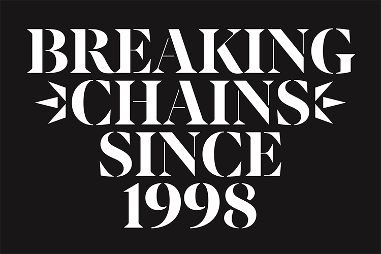
The Vocal Type site sets out a potted history of Seals’ life: his rare childhood brain tumour, which in a way, led him to type, since he spent his illness drawing and writing to pass the time; his early experiences of racism; how at around ten years-old, he started selling $3 bespoke graffiti name cards to kids at his school; the influence of 1987 thesis Black Designers: Missing In and its 2016 sequel, Black Designers: Still Missing In Action.
He writes that Vocal Type really took off in 2020 after the police murdered George Floyd, and his subsequent inclusion on countless ‘Black designer’ lists. “There was this burning thought that every opportunity I received was not because of my talent or efforts. It was because of George,” writes Seals. “Since George’s murder, my typefaces have gone from being inspired by progressive movements to becoming a part of them.”
All of that biography directly informs the designs of stencil font VTC Tré: the “surgically cut letterforms”; and the influence of protest signs, graffiti, political communication, and storytelling. The font family comes in three optical sizes – display, subhead, and text. “This way, it can be used for the body copy of a book or your next protest sign/graffiti piece,” says Seals.
Marbles by Superfried and F37
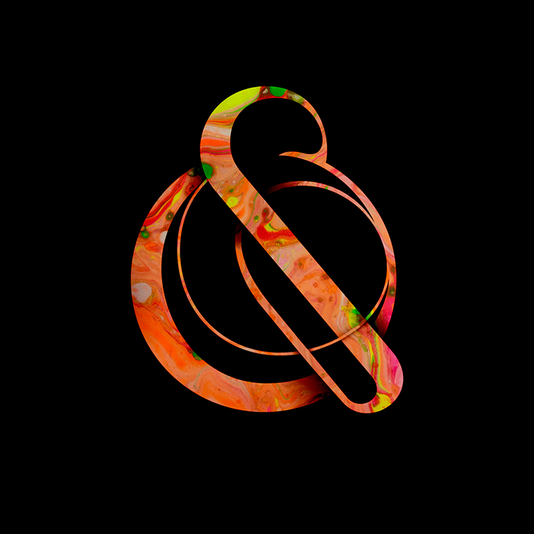
Marbles started out back in 2016, when Manchester-based design studio Superfried proposed a “little typographic idea” for a New York magazine project. While the idea was turned down, it’s since been “recycled” as a personal project.
Initially, Marbles began as a “very organic, fluid experimental set of 2D numerals,” Superfried explains. This developed into 3D renders of lettering as well as numbers, and eventually became a full typeface thanks to a collaboration with the F37 type foundry as part of its new F37x collaborative offering. “I had never imagined this typographic experiment would ever work as an actual typeface since the character forms were so complex and eccentric,” says Mark Richardson, Supefried founder.
Richardson worked with F37 type designer Rodrigo Feunzalida to create the complete Marbles font family, which now comprises two typefaces, Marbles Complex and Marbles Simple, and four styles.
Fenul by Displaay
Over the years Prague-based typographic studio Displaay has built itself a reputation as the type designers’ type designers, having seen their fonts used by famously font-loving clients like design studios Pentagam, Kurppa Hosk, and &Walsh.
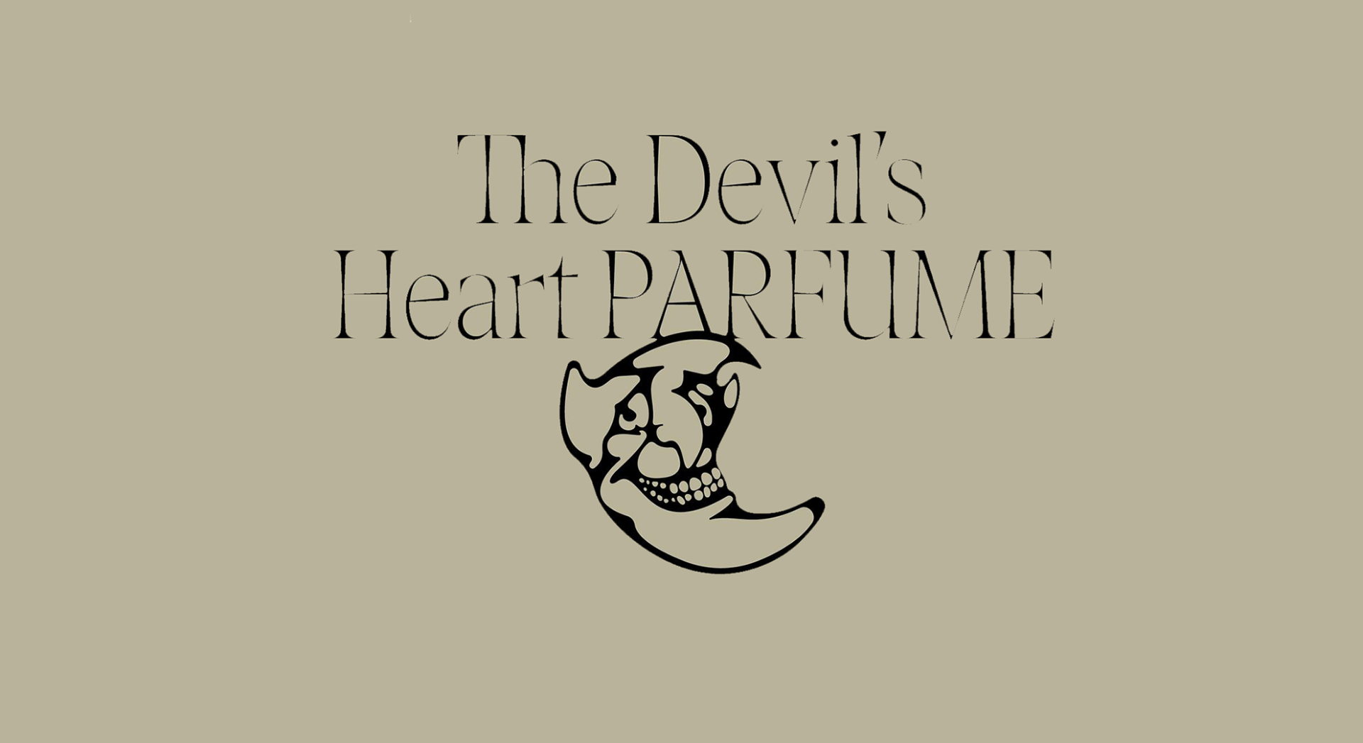
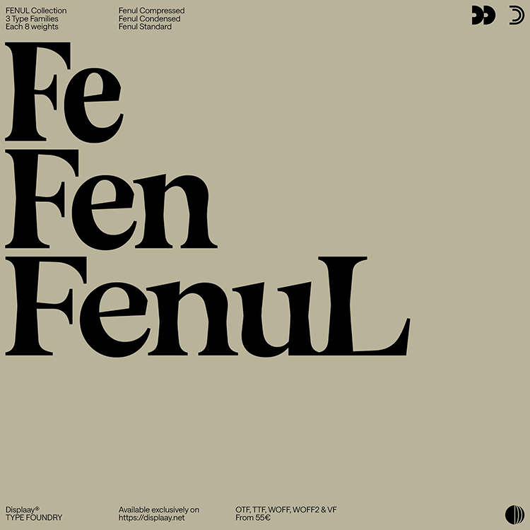
Among the studio’s 2023 releases was a beguilingly goth-leaning type collection called Fenul, with its three font families – Compressed, Condenses, and Standard available in 24 weights and 24 styles. Italics will be available early next year.
Fenul’s design was inspired by an anatomy book, “specifically the chapter on bones,” says Displaay. “You can easily spot their characteristic thinner centres and heavier ends. This serif typeface follows the same construction principles and also incorporates striking variations in weight and width.”
Giallo Roman by Stereo
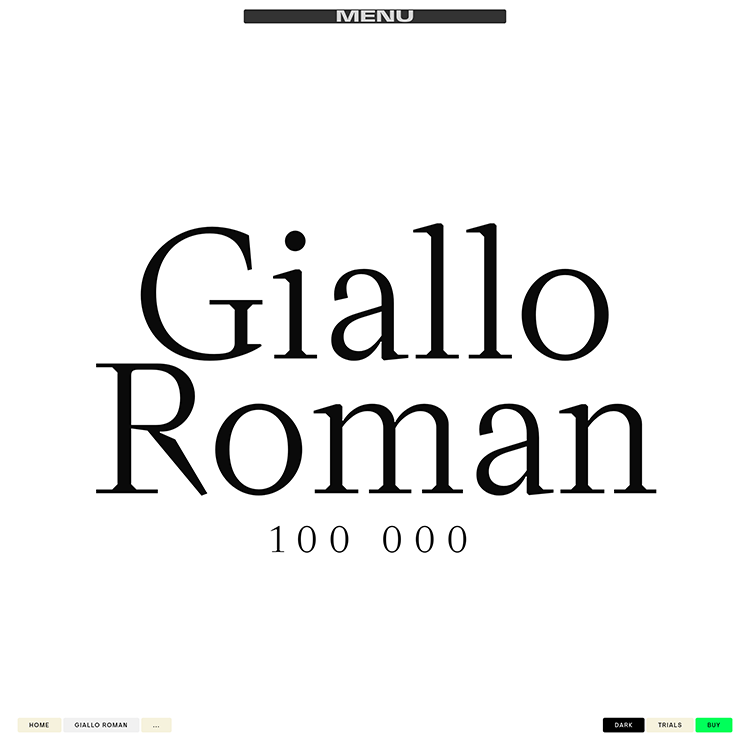
Finally a font uniting our love of cult Italian horror movies and slightly off-kilter workhorse serif fonts. Created by Stereo, a type foundry based in Berlin, Giallo Roman is named after both the Italian literature genre and its arguably more famous cousin, the film genre popularised in the 1970s by directors like Dario Argento and Mario Bava. known for its marriage of trashy, camped-up drama and stunning use of vivid Technicolour film stock.
Giallo Roman started life in 2020 when Stereo started to create a non-proportional monospace font, which gradually grew into the full Roman type text version released this year. The designs are inspired by 16th century Italian old style serif fonts such as Rome-born Robert Granjon’s Gros Cicero.
Giallo Roman “combines this calligraphic warmth with a digital vector look and a modern approach to the letter construction as well as proportions,” says Stereo. “There has been constant exploration of how to break traditional type design methods and to create characters that would normally not be possible or thought of, when using traditional tools in regular ways to design or cut a typeface. At the same time care was taken to preserve the appearance of its Roman type roots as much as possible.”
The range of weights varies widely between its Light and Black extremes, which bring different characteristics of the font to life and mean it works well for display purposes as well as its workhorse text-based applications.
ABC C-o-n-n-e-c-t by Dinamo
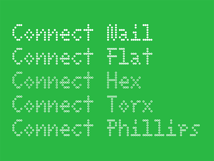
Basel- and Berlin-based foundry Dinamo never disappoints, and earlier this year took type to a whole new physical level. Dinamo collaborated with product design studio BNAG to create a tool for affordable, accessible DIY furniture making, which comes with its own digital dot font, ABC C-o-n-n-e-c-t.
The font is directly inspired by the ABC C-o-n-n-e-c-t-o-r-s physical brackets created by BNAG and Dinamo, which are used to join wood for easy DIY furniture-making. Makers can also use the grids to create letter shapes or other patterns from screws; and it was this application that Dinamo drew from to design its dot font.
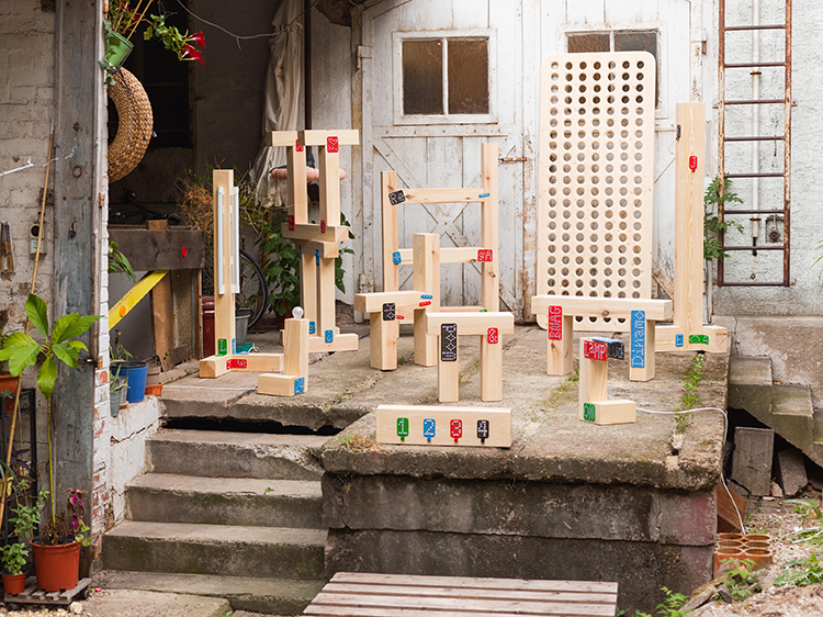 Dinamo’s new publishing imprint, Dinamo Editions, has also released the font/product’s accompanying zine, C-O-N-N-E-C-T: A Blueprint for Collaboration. The publication contains instructions for possible furniture designs made using the ABC C-o-n-n-e-c-t-o-r-s as well as the “blueprints” for creating letterforms with screws inside the brackets’ metal grids.
According to Dinamo, the project looks to bring people together physically, and to celebrate and reclaim the idea of “connection” outside of social networking.
-
Post a comment
