Amazon dimple takes the lead in Prime Video’s new identity
Brand assets have been overhauled by Pentagram in a bid to add movement to the brand, which has been animated through a new suite of motion graphics.
Pentagram partner Emily Oberman has led the redesign of Amazon Prime Video’s new visual identity, developing the dimple arrow of the Amazon smile into a graphic device.
In an increasingly crowded landscape of streaming services, Prime Video looked to Pentagram for an identity that could highlight its original content, flex to fit all genres from drama to comedy, and take cues from the Prime parent brand while adopting its own distinctive characteristics. The platform’s new strategy positions it as “a rabbit hole of entertainment” where viewers can become immersed in its collection of shows and movies, according to Pentagram.
Opting to evolve a familiar brand asset in an inventive way, Pentagram gave the Amazon dimple a new role in Prime Video’s visual identity. Instead of sitting stationary in the logo, the dimple is now used across motion graphics as a framing device for imagery in a bid to “break the fourth wall in a way that interacts with the audience”, says Pentagram.
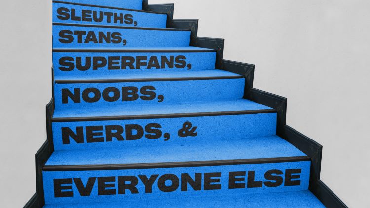
The studio commissioned Lucas Sharp from NYC-based Sharp Type foundry to create a new bespoke typeface called Prime Video Sharp. It is a customised version of Sharp Grotesk, which combines Swiss styling with 20th century American wood type. Its expressive ink traps and “strong, friendly” presence work well with the rest of the Prime type family and aim to “support the exuberant tone of the messaging”, says Pentagram. Prime Video Sharp is also designed to work alongside the brand’s bespoke suite of illustrated “Iconics”, which appear in many forms, from vampire fangs and the rings of Middle Earth to footballs and cowboys.
Pentagram explains that the Iconics seek to “represent various genres or create a rebus-like shorthand”. The Iconics were created by illustrators at Netherlands-based studio Patswerk and add further movement to the brand when they become animated and interact with the typeface.

Though Prime Video’s new identity sees its familiar blue retained, the colours applied to the motion graphics and Iconics can be adjusted according to the mood. “Two distinct visual modes” were designed to represent different types of content”, Pentagram explains; one featuring Prime Video’s bright blue “for a pop culture feel” and another adopting darker tones to evoke a more “serious, sophisticated and dramatic” ambience.
The streaming service also has two new animations, which will act as idents and run at the end of each promo with the dimple acting as “a dimensional portal” to transport viewers into the platform, says Pentagram. Pentagram did one and the other “cinematic 3D version” was created by FutureDeluxe for original series and films, the studio adds.
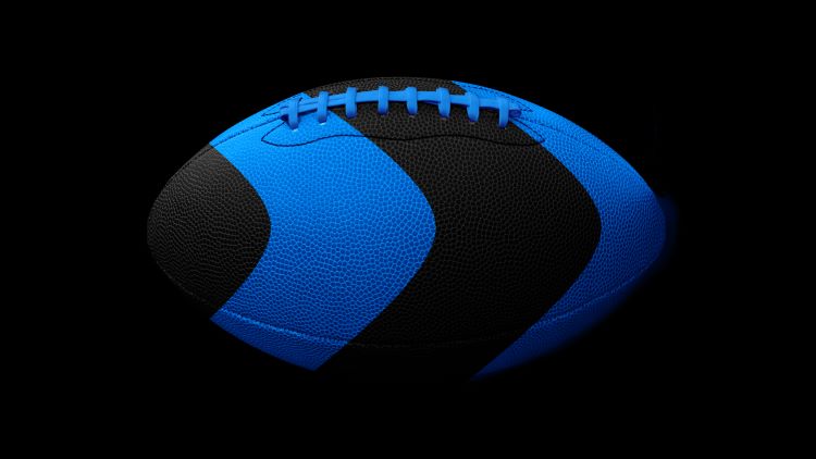
Prime Video’s new visual identity will appear across everything from billboards and social media, to motion graphics, TV spots and the graphical user interface of the Prime Video player.



It’s always good to see new work from Pentagram which is still the World’s No1 Design Studio in my humble opinion. If it hadn’t been for the original founders we probably wouldn’t have the graphic design industry we have today.
I’m quite surprised by the icons though; they don’t appear to be particularly sophisticated, but maybe that’s just me…I am an old fart after all and quite possibly not in the primary target audience. So perhaps what they really are are ‘playful’. But being a long time Amazon user and Prime subscriber (as I’m sure very many other wrinklies are) I would have preferred to see some slightly more elegant icon imagery to match the elegance of the new typeface.
But still, it’s a Pentagram project so it’s brightened my day to see it.