Aston Villa FC rebrands to reach next-generation football fans
Aston Villa FC has revealed a glimpse of its new brand identity by Dragon Rouge through a redesigned crest, with more to come later this year.
Dragon Rouge has repositioned Aston Villa FC, “reigniting authentic brand assets” including the crest, as part of a wider strategy to reach next generation audiences.
The studio says it came out on top following a tender process initially involving over ten agencies. Dragon Rouge creative director Becky King says that the project gave the studio an opportunity to build its portfolio in this area, as it has also worked with French football clubs PSG and Lille.

“Football clubs can no longer think of crest and colours only. They must think like global entertainment brands and need their design assets to support that ambition”, says King. To achieve this, she says that clubs require “a flexible, characterful, rich brand identity” that has the ability to appeal to “next generation audiences” and a variety of channels as well as considering future developments and plans.
Aston Villa FC is the first club to rebrand under new FA and Premier League guidelines, which state that fans must be part of the consultation process for any major changes to club crests and colours. King says that consulting fans was crucial: “We used different fan groups at key moments”.
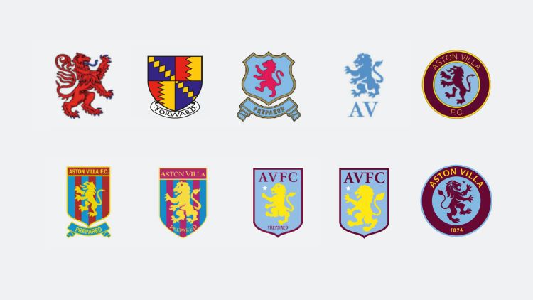
While the previous crest depicted the club’s heritage in a simple, two-dimensional design, it had its shortfalls, such as only including the club’s initials and the “weak” colour contrast, according to King. Opting for “a classic design with a modern twist and agile approach”, King says that Dragon Rouge sought to build on its strengths and make it so that the individual components of the crest could be “unleashed and used separately”.
The studio homed in on the lion in the centre of the crest, which references the club’s Scottish founders. King says that the new design retains the lion’s stance but switches the direction that it faces, aiming to signify “the progressive, forward-facing nature of the club”. This also better reflects the design on the very first Aston Villa FC crest, which also faced right.

The club’s name now appears in full on the crest, along with its founding date. King says that to make the crest work at all sizes, Dragon Rouge augmented “the crafted details” of the design, overall making it “a more practical and distinctive design asset”.
Aston Villa’s “warmed up” yellow, visible on the crest typeface, seeks to add a touch of class and “reflect the club’s warmth”, says King. The reworked colour palette aims to put claret and blue front and centre once again, while retaining the “familiarity of yellow” to light up the name, she adds.
King says that the challenge with this project was to balance “the respect for tradition, historical details” and sentimentality with “the desires to modernise, be progressive and stay distinctive”. She adds that studios undertaking similar projects “should not underestimate the consultation challenge”.
The final consultation on the crest sampled over 20,000 fans, with an “overwhelmingly positive” response, according to King. She says that 77% selected the winning design.
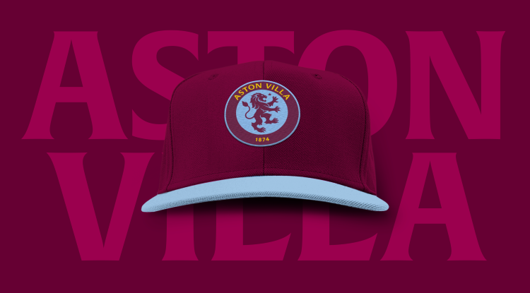
In a bid to create “a more confident brand” for the club, King says the studio designed a standalone wordmark for “its unique name” so that the full crest “can be unleashed from its retaining shape”.
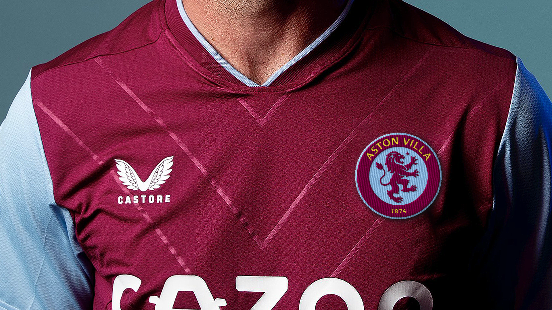
While the crest has already been revealed to fans, these new assets show how it might be applied. Now Dragon Rouge is working on a full identity, which will be revealed in May.
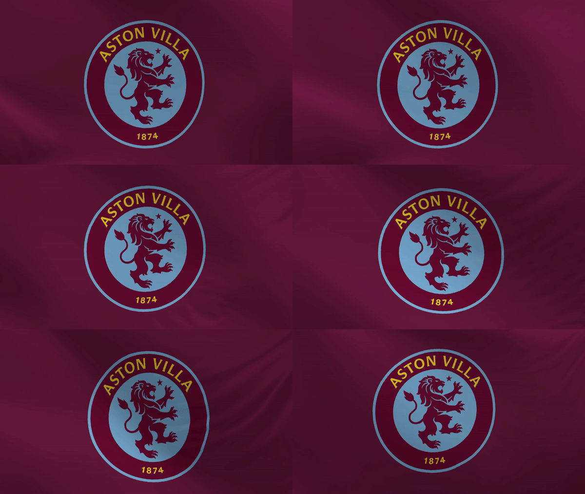
Aston Villa FC’s wider brand expression focusses on bringing assets “fully to life” and will include new colours, bespoke fonts, illustrations and motion graphics, says King. “There is a concept that is driving it all but you’ll have to wait to see”, she adds.
The big reveal is planned for the club’s last game of the season when it will start to roll out across all channels.




Nice work. But it’s not a REBRAND!!
Rebranding is name and organisational change, not a ‘revitalisation. Get the terminology right DW.
Looks too close to Chelsea FC. I would have gone for a full lions face more intimidating.
This new redesign is fine, but I think the other finalist was far better. It kept a similar shape and modernized it while keeping the same structure
Why are graphics for the world of football, and sports generally, so dull and predictable, as with this ‘rebrand’?