Nationwide overhauls its identity for the first time in 36 years
Designed by New Commercial Arts, its new identity features a simplified icon, refined wordmark, functional colour palette and illustrations that look to position it as a “dependable disrupter”.
New Commercial Arts (NCA) has overhauled Nationwide’s new identity in a bid to position it as a “dependable disrupter” in the financial services industry with a refined colour palette and logo.
This marks the building society’s first major rebrand since 1987. Nationwide chief customer, brand and engagement officer Catherine Kehoe defines Nationwide as “a scaled challenger” as it “doesn’t do banking in the way that traditional banks do”, however, it has “more trust and experience” than new banks or fin-techs, like Monzo or Revolut she adds. NCA co-founder Rob Curran and his team took the idea of Nationwide as a “dependable disrupter” and applied it to everything from the wordmark and icon to the colour palette and illustrations.

“A real design heritage”
Staying true to Nationwide’s heritage was part of NCA’s brief and Curran says he found “a real design heritage” in the archives, particularly with typography. He describes the archived fonts as “friendly yet grown up” and notes how there was a lot of condensed lettering, which has now “come back into favour”.
For the wordmark, NCA designed a customised version of Founders Grotesk. Modifications included “opening the terminals of the e and the a” and “rounding the tittles of the i’s” to soften the font, says Curran.
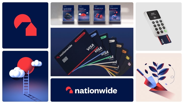
A noticeable change is Nationwide’s move to a lowercase n. Aesthetically, this makes all letters the same height, Curran feels that a capital N would disrupt the flow from the icon into the wordmark. The goal was to make the wordmark appear “modern but familiar” and “simultaneously bold and humble”, which invovled hundreds of iterations, according to Curran. Building Society was also dropped from the wordmark in an effort to make it “cleaner and sharper”, Kehoe adds.
Taking influence from Nationwide ads from the late 80s and early 90s, NCA switched Nationwide’s serif heading font from Cabernet to Editorial, pairing is with an unmodified version of Founders Grotesk for body copy.
“A rising sun”
Nationwide’s village icon has been relatively untouched structurally since 1987. Initially, both NCA and Nationwide were unsure whether the circle icon in the logo was a tree or a sun, until the archives revealed that it was green in older versions, according to Curran.
Despite this, he says testing revealed that most people see it as “a rising sun” which carries positive connotations and frames the house nicely, given that Nationwide’s core brand is mortgages. He explains how NCA reduced and simplified the icon to the point where it is still familiar but “if it was reduced any more you’d lose it”.
After removing the “fussiness” of the village icon, NCA was left with the “dominant shapes” and used negative space to paint the familiar house shape in front of the rising sun icon, says Curran. He adds that it was “instantly recognised as Nationwide” during testing.
Replacing stock illustrations, NCA designed a new suite of ownable assets in which the sun plays a role. Curran describes how the sun “casts shadows on the illustrations” which appear in uniform red, white and blue hues and are “intended primarily for meaning”, rather than being ornamental.
Nationwide also ditched its character illustrations with exaggerated proportions and NCA made the decision to omit photography from the new identity. This was in favour of making things “useful and meaningful” rather than having “arbitrary reflections of random people”, says Curran.

Recommended: Pentagram helps Virgin Money launch as challenger bank
“A sea of sameness”
Blue is a common colour across the financial services sector and Nationwide wanted to avoid the “sea of sameness” of traditional banks while avoiding the “fin-tech, neo-bank look and feel”, like Monzo and Revolut, says Curran. He thinks that the latter was initially “new and fresh” but has now become dominated by neon.
The blue and the red of the old identity was “showing its age the most”, according to Curran, as it was “too bright, too brash and too primary”. He notes that, with the new palette, Nationwide was conscious of not “cheapening the experience” but neither did it want to “give off signals of luxury”.
Nationwide’s new darker blue was chosen with accessibility in mind and has a “really good contrast ratio” with the new red tone, AAA accessibly in large text and AA in regular text and graphics, Curran reveals.
A secondary palette of accent colours comes into play, with names like reflected summer yellow, bakery orange, and charm pink. Curran explains how these hues are inspired by “colours from society” and provide an “accent of warmth and modernity against the blue”, but will never be seen on large applications.
Recommended: Challenger banks don’t stand out anymore but can designers save them?
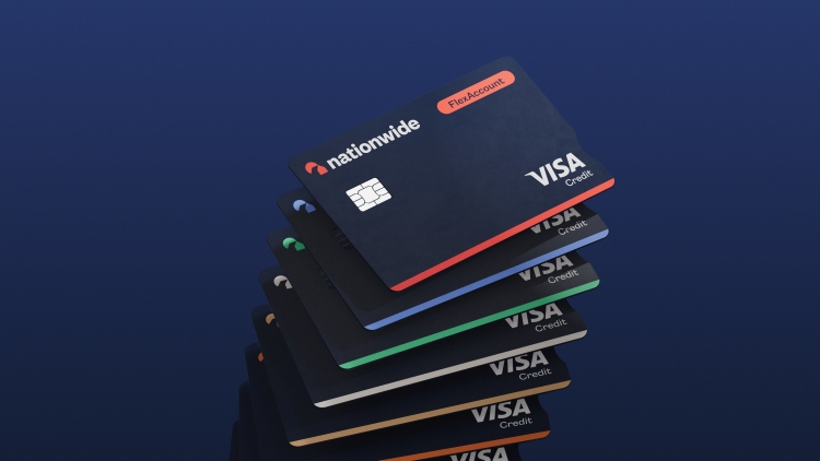
Colour is also used in a functional way in the new identity, which has not been done in the sector before, according to Curran and Kehoe. Kehoe describes the new bank cards as “stunningly simple and accessible”, as they use colour to signify which type of account the card relates to.
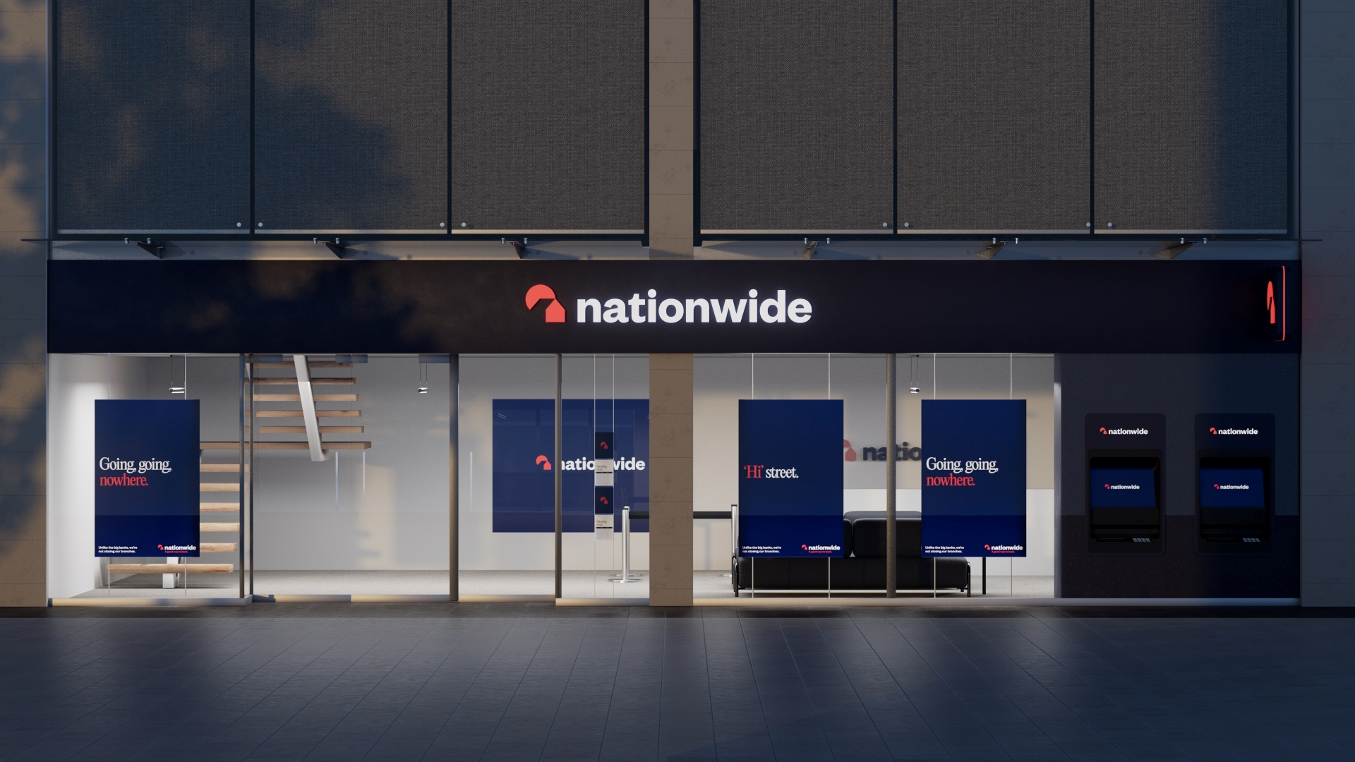
In the physical branches, the wordmark will appear on the façade lit from behind with the icon also displayed on the hanging signs, which protrude from the outer wall. Nationwide’s new identity has already started to roll out over the weekend of 7-8 October across 12 branches, with all 605 due to be finished by July 2024 and new banks cards will appear from 23rd October.
Congratulations. They have rebranded as NatWest. You couldn’t make it up
My thoughts exactly! Like Natwest. When the app icon changed on my phone I thought there had been a glitch.
Why was my comment removed?
Hi Tom, All comments are approved by the Design Week editorial team and published manually. Your comment wasn’t deleted, we just hadn’t got to it yet. Many thanks, Tom
They have really done a bad job here, there was no need to change anything.
It looks like a Pacman eating a house!
Beat me to it.
And the “house” is flat.
Another reason why this design sucks.
My bad, you can remove the last ones 😉
You’ve obviously gone to a lot of effort with this, but unfortunately you seem to have confused Nationwide with Natwest.
Judging by Nationwide’s Twitter/X page the rebrand has bombed big time. Hundreds of negative comments and so far just one positive. What were they thinking? The lowercase n is just jaw dropping, let alone 20 years too late for a fad that wasn’t accepted back then either.
What on earth were they thinking? Oh… yes, they were thinking NatWest, of course. Brilliant. I was struggling before differentiating the two as I bank with both, now it’s a nightmare.
I’ve been with Nationwide my whole life and this is soo horible it might make me move so i don’t have to look at it, the lack of a capital N for starters, then the darker blue is more business than freindly, it feels more corperate bank than helpful building society which is what i like about them.
“lack of capital n”.
Why do Corporates (sorry corporates) do that ?
(currys, bp amongst others.)
They look puerile.
As if the company has been taken over by a bunch of teenagers – trying to look cool.
Surely the company wants to stand out ?
There is a reason why UK road-signs are amongst the most readable in the world.
The font helps (not as narrow as French) – but mostly because of the first Capital letter – followed by the profile.
To seconds Toms comment – literally just passed a rebranded branch in the high street, two doors down from a Natwest…it looks like a specialist mortgage division of NW. Seems to have lost the confidence and timelessness from before.
Lacks any presence (or sense) and the lowercase typography makes it feel like a footer.
Looks like a giant pacman eating a house. Bring back the capital letter too. If it aint broke, dont fix it!!!
My first thought was Pacman coming to get your house! How much have they paid for that?
The first time I saw the new logo I thought “It’s a bird; it looks like a bird viewed through a tilted keyhole”. I can’t unsee that even though I can work out what it’s meant to show.
I had to remove the app from my home page as the colours were too depressing.
Nationwide is a name and noun and should begin with a capital letter.makes me angrey that they csnt spell. However on their letter heading it is spealt with a capital.
Like others have said look too corporate and similar to nat west. Sorry Nst West.
Oh. Ps. I thought the sun was usually yellow.
Spend our money on the people not the designers.
The sun is only yellow if you’re a six year old child…
Unpopular opinion but I actually think it looks a lot better than the old one, every time I used my card it felt like I was still living in the 80s!
It may be similar to NatWest but I think that’s only because of the basic shapes and colours – but it’s important to remember that NatWest don’t own colours, just like HSBC and Santander are red too!
That’s what I love about the design industry – you can always rely on the constructive criticism.
A complete waste of effort and money on a totally unnecessary rebrand that none of Nationwide’s customers (who are the OWNERS of this mutual organisation) asked for. A rising (setting?) sun that illuminates the wall of the house facing away from it. A lower case initial N that looks juvenile and illiterate. Worst of all, the removal of the words “Building Society” and their replacement by a strapline containing the word “bank”, immensely damaging to the brand and values of Nationwide.
Think of the new logo as a setting sun, which we can’t see, illuminating the gable end of the house and the tree. It works then, sort of. Incidentally, are they really trying to convince us Nationwide didn’t know that the tree was a tree without searching archives? It only takes a few seconds for an Internet search to pull up the original Nationwide Anglia logo from 1987.
“Think of the new logo as a setting sun, which we can’t see, illuminating the gable end of the house and the tree. ”
How do you see any of that ? It’s all flat.
And what “tree” ?
The previous logo had some craft, some depth, some effort.
Why do designers insist on foisting minimalism on us?
Apart from being ugly – minimalism conveys lack of respect for customers, and cheapness….
….while usually costing more !
I think when you have not changed the logo and design for as long as Nationwide had previously, I think there will always be backlash. I was taken back by the new design as it just appeared on my phone, I would have liked some warning. I was fond of the old design but more out of similarity than anything else because looking back it was a little dated. I think it will take me time to get used to it.
Great work! Much more modern. Love the presentation as well as the thought that went in to the rebrand.
Funnily enough, I am more critical of the new advertising campaign than the rebrand. One of the press ads which is also in the branch windows says ‘Hi Street’ and claims that branches will not be closed down. However they were closing branches as recently as February this year. So my questions is; for good or bad, is the new brand a smokescreen or a genuine piece of communication since it should adhere to values such as honesty, integrity and above all trust. Other press comments have said the same things asking how they can reconcile the new brand with the messaging and closing branches.
I thought it was a bird in front of a keyhole; I still think it looks like a bird. The lower case ‘n’ is annoying but fits well with the design so 1 out of 10 for that.
To be honest the mass appear to be concentrating on art and design and forgetting about why a company even exists.
Nationwide is a company and it’s primary objective to to grow, evolve and serve.
I have banked with nationwide for seven years and never once had an issue with them so service is one of the best in the UK.
Personally I WELCOME the re brand, it shows a company wanting to evolve, take changes and yes if you want success in anything you HAVE to take chances.
FEAR OF CHANGE.
Most suffer from this in a changing world, it leaves one stagnant.
I say go for it nationwide. Evolve, change, express, take chances and serve.
Sorry but “fear of change” sounds like both an insult and a deflection.
A (civilised) counter is:
That is “change for change’s sake”…
…followed by:
“if it ain’t broke don’t fix it”.
I have seen corporate logos evolve – with subtle changes.
But they don’t have to throw out what makes a logo both recognisable and sophisticated.
(To be clear. I have never seen a Minimalist logo that looks “sophisticated”.)