Goldmine Gummies looks to bring fun back to the cannabis market
Robot Food’s illustration-led identity for Goldmine Gummies moves on from cannabis cliches to focus on the idea of “good old-fashioned fun” for adults.
Leeds-based studio Robot Food has created an identity for Goldmine Gummies, using playful illustrations to demystify the benefits of its cannabis-infused products for new consumers.
Robot Food design director Chris Shuttleworth explains that the studio was brought in after previously working on the branding for parent company Breez. While already “a market leader” in some areas of cannabis products, he says, “Breez wanted to break into the world of gummies”.

According to Shuttleworth, the existing gummies market in California was divided into “grown-up and natural” brands such as Wyld, and a “quite cheap and artificial” look, that you might “expect to see in a market”.
Goldmine Gummies wanted to offer something different to a crowded market with a brand “that breaks through the noise just by the joy it sparks for our fans”, says Breez CEO Austin Hice.
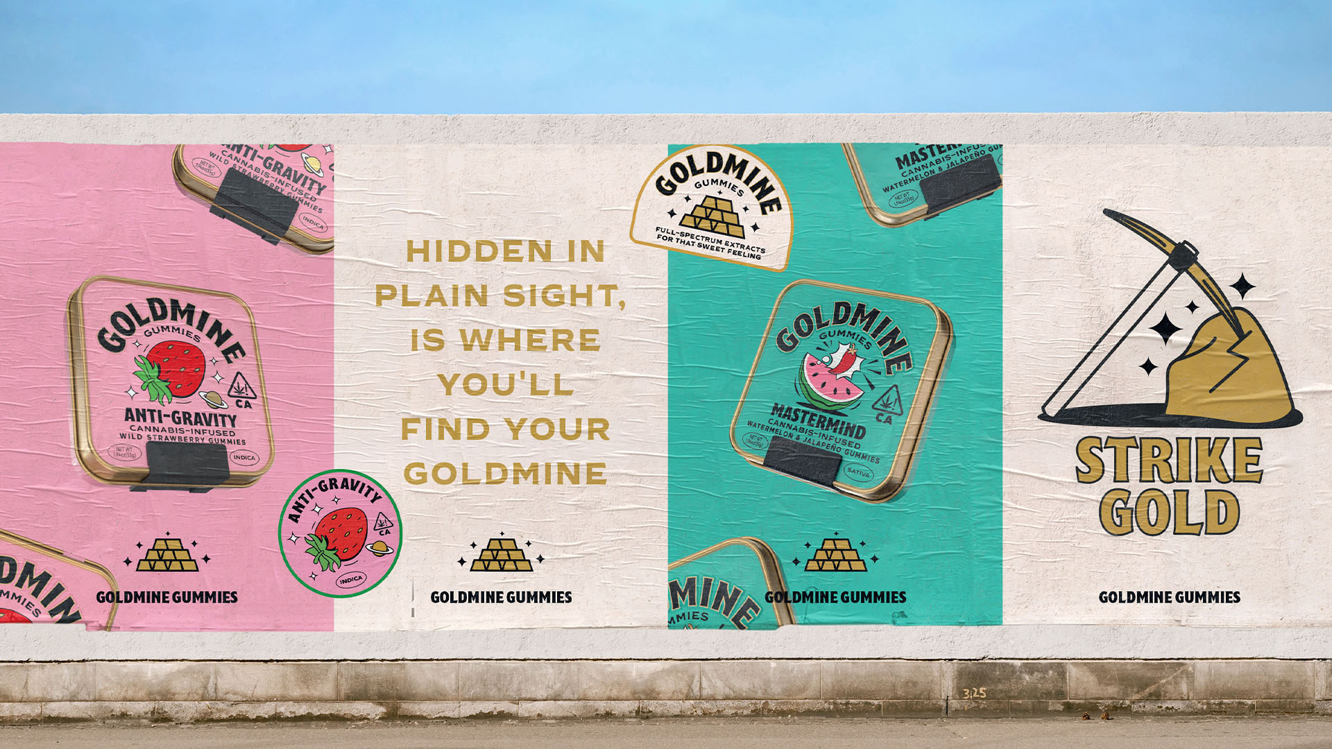
The identity created by Robot food is led by nostalgia-tinged illustrations which tap into the idea of “good old-fashioned fun”, something that nobody was really doing, says Shuttleworth.
However, when designing for the cannabis industry, as with alcohol products, “it can’t look too childish”, he adds.
There was a need to strike a balance between appearing fun “but also trustworthy”.
According to Shuttleworth, competitor brands weren’t very clear on the benefits of the cannabis variants, and while products would be labelled with “Sativa or Indica or hybrid”, there seems to be an expectation for the consumer “to know what that means and what it’s going to do to them”, he says.
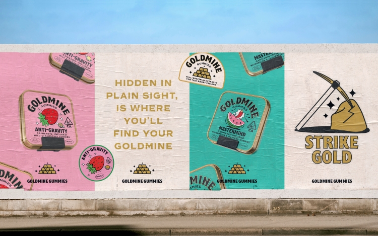
Suggesting that this “can be off-putting for somebody that’s not familiar with that world”, Robot Food’s designs sought to “try and capture the effects of each product in an easy-to-understand way”.
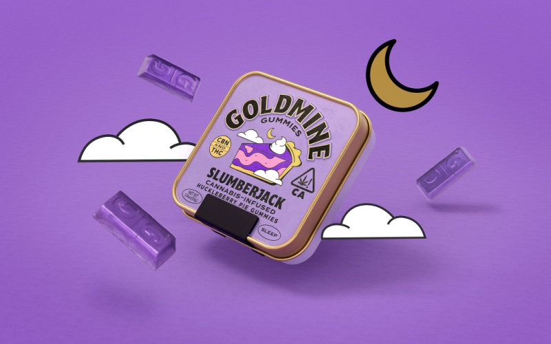
A focus-inducing product containing Sativa is called Mastermind, while the “more docile” CBN-infused product is named Slumberjack. The character of each is also communicated through the illustrations, which were created in-house by Shuttleworth.
Building out from the illustrations, Shuttleworth says the studio had “a lot of fun” creating a “big Goldmine world to explore”.
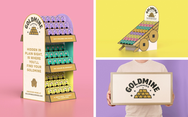
In retail environments, the displays appear like “upturned mine carts that you just found in a gold mine”, Shuttleworth says. As cannabis products are not allowed to be advertised on billboards or on television, “there is opportunity to bring it to life at the point of sale”, he adds.
The gummies come in a square tin, featuring a custom-engineered patented child-resistant lock. The reusable tins are designed as something “that you want to keep on your desk”, Shuttleworth explains, with embossed lettering for Goldmine and a rolled gold edge giving it a premium feel. The gold continues inside, “so it’s like you’re opening a chest”, he adds. The gummies themselves are embossed with a “G” for Goldmine and shaped like gold bars.
For the website, Robot Food worked with Hungry Sandwich Club, “to develop animations, make the website super usable and fun, and bring to life these animated worlds”. Collage-style illustrations add “another dimension” and “bring to life the benefits” of the products, Shuttleworth says.
Goldmine Gummies have launched in California, and the identity has rolled out across its website, retail touchpoints, packaging materials and merchandise such as enamel pins and t-shirts. According to Anna Walters, CMO at Breez, the product will expand “nationwide and globally as soon as laws and regulations allow”.
-
Post a comment
