Earthling Studio flies into new territory for Brewdog sub-brand Wingman
The Scottish craft brewer’s new Session IPA will sit among the core range but take on a more “anarchic” aesthetic centred around an edgy eagle character.
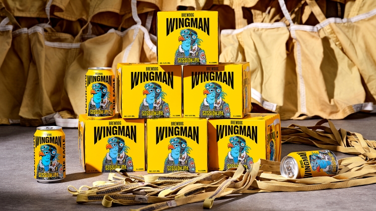
Earthling Studio has designed a mascot-led identity for Brewdog’s new Session IPA, moving away from the “minimal aesthetic” synonymous with its existing beers.
Over the past 12 months, Earthling has worked on several projects with Brewdog but the Wingman project marks its first brand creation with the brewer. The studio was tasked with developing a new sub-brand identity for “an easy-drinking session IPA”, says its founder and creative partner Stephen McDavid.

By introducing this type of beer into its core range, Brewdog sought to “offer something new to its audience who love to experiment and try new styles”, says McDavid. He explains how the “easy drinking nature” of a Session IPA – a lower alcohol percentage version of an India Pale Ale – makes it suited for “good times with friends”. When looking through names that would resonate with this occasion, the studio landed on Wingman.
Read more: BrewDog’s 2020 identity – who designed it and how it was done
From the offset, Brewdog was keen to have a mascot at the centre of the brand, giving Earthling “the creative freedom to develop a character with depth and authenticity”, says McDavid. While there is “a heritage of characters in the Brewdog DNA”, from squirrels to sharks, McDavid describes Wingman as “the first mascot-led sub-brand”. He believes the Eagle embodies “the strength and free-thinking spirit of Brewdog”.
The concept for the Wingman illustration was developed in-house at Earthling before an external illustrator (who would like to remain unnamed) was tasked with refining the Wingman character and his style. McDavid notes that Earthling wanted to “move away from a minimalist aesthetic” and that the illustrator’s “off-beat anarchic style” was well suited to the “discovery details” that are part of Wingman’s back story.
Read more: Brewdog unveils “humble” vodka brand
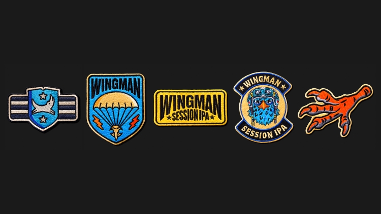
Tattoos and jacket patches on the character aim to subtly reveal elements of the Wingman narrative. Those with an eye for detail might be able to spot an eagle foot worn “to honour his feathered comrades”, an anchor nodding to his time in service and tally marks, which “keep count of the good times”, says McDavid.
Bespoke typography makes up the Wingman logotype, which is drawn on a curve and frames the character. With the colour palette – a combination of yellow, blue and black – Earthling sought to clearly differentiate the new beer from the rest of the Brewdog range. These hues were also chosen to represent the beer’s taste profile, which Earthling managing partner Tom Bruce describes as “a refreshing IPA, with tropical fruits a sharp citrus aroma”.
Speaking on why this brand is so different to other core brands in the range, Bruce says: “Brewdog has always been a brand that doesn’t follow the status quo and despite its success, it still embodies a challenger mindset”. He adds that one of the biggest challenges was working quickly to deliver a new sub-brand “with an authentic mascot, under the heading of an established brand”.
A set of master animations were designed in-house at Earthling to introduce the character. These were inspired by “character-led animated movie trailers” as the studio wanted to give Wingman “a heroic edge, seeding the idea that this is the start of something big and that there is more to come”, says Bruce.
Wingman’s identity will extend across various touchpoints, including tap-handles, lenses, glassware, multiple pack formats and merchandise.
-
Post a comment


