“A bolder composition”: designing the 2023 Booker Prize winner cover
Inspired by jazz record covers and the “brutal” imagery of oppressive states, Prophet Song’s cover was designed to depict the hostile environment inhabited by the characters.
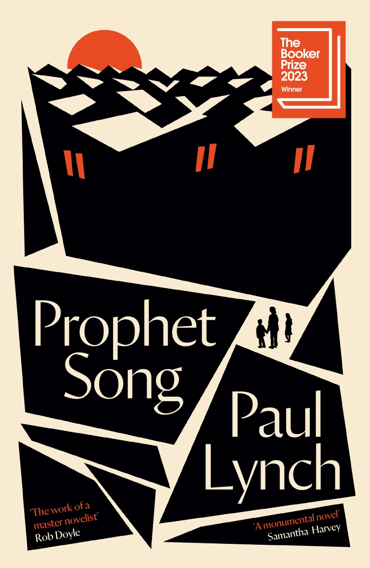
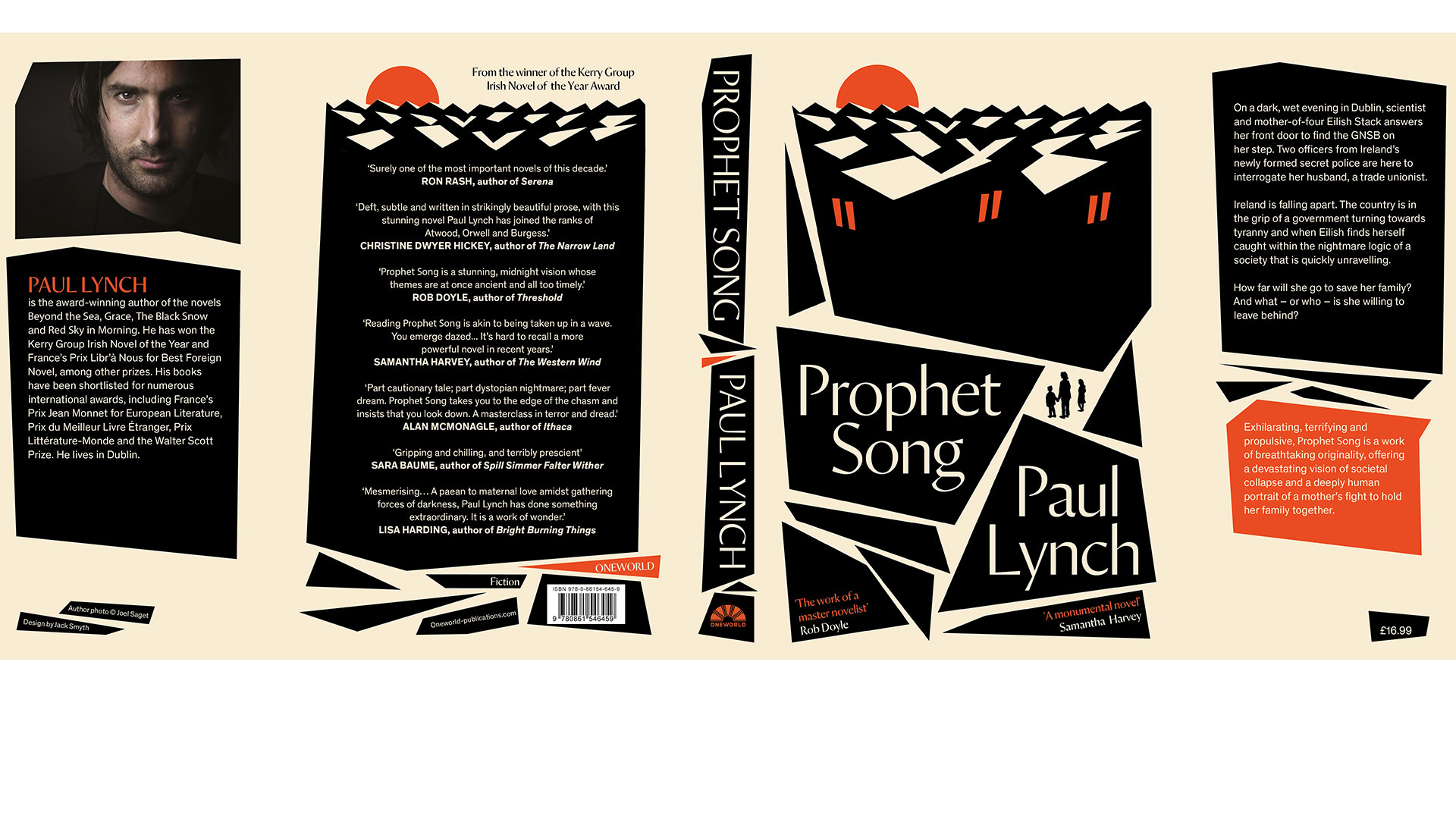
Dublin-based illustrator Jack Smyth has designed the cover for the 2023 Booker Prize winner Prophet Song by Irish novelist Paul Lynch, contrasting “sharp and aggressive” geometric shapes with “organic, hand-drawn human figures”.
Lynch’s fifth novel – published by Oneworld – follows a woman as she attempts to save her family in a dystopian and increasingly authoritarian version of Ireland. Oneworld’s art director Ben Summers got in touch with Smyth to say that Lynch had requested him to design his book cover, which Smyth says “doesn’t happen very often”.

He notes how Lynch was “switched on to the cover design process” and “visually orientated”, adding that he thinks the fact he is Irish also worked in his favour for this project. Smyth claims not to have a particular style in his work, which he believes allows him to do “whatever is required for the book” rather than being led by his own wants. His method is to always keeps the text at the forefront of the process.
Initial iterations of the cover “weren’t quite right”, according to Smyth, and so he met with Lynch to discuss the things he liked and didn’t like about the designs. He describes this as a “rare situation where the author is quite heavily invovled” in the design process.
Read more: Behind the cover design of the 2022 Booker Prize winner

Over coffee, Smyth and Lynch spoke about shared interests, such as jazz and collecting records, specifically their admiration for mid and late 20th century jazz record covers. Lynch wanted the cover to be “a bit bolder” and more “brash” and Smyth says he gave him licence to do “something more exciting” with it.
With the notes from Lynch in mind, Smyth re-read the book and “took a new perspective to it”.
The final version of the cover features “blocky, bold shapes that are in tension with each other” similar to that of a jazz cover while also referencing how the book “creates tension on a page”, Smyth explains.
Read more: Judging a Booker by its cover
View this post on Instagram
He says he feels strongly about a “less is more” approach when it comes to colour on a cover. For this project in particular, he felt that a “restricted palette” allowed the shapes to be “sharp”, resulting in “a bolder composition”. Smyth describes the imagery and iconography of oppressive states as “really brutal and un-decorative”, which is why he opted for “sharp and aggressive” geometric shapes to contrast with the “organic, hand-drawn human figures” on the cover. Ultimately, he says it represents the difficult environment that the characters in the book are inhabiting.
Within this bolder composition of shapes, Smyth says the typeface – Orleans by Commercial Type – appears “more delicate”. In his view, type is a “core component to a book cover”, whether it uses bespoke or existing fonts.
The “chiselled feeling of Orleans” gives it “a slight delicacy and fragility”, says Smyth, which reflects the fragility of the Irish state in the book.
-
Post a comment


