Elmwood gives The Week brand toolkit based on its red masthead
New brand assets look to connect to The Week’s readership in order to make the red masthead “memorable and meaningful” in itself.
Design consultancy Elmwood has created a brand toolkit for The Week’s non-editorial touchpoints with its distinctive red masthead as the “centre point for powerful storytelling”.
Elmwood executive creative director Andrew Lawrence explains that though The Week has “a very defined look and feel”, it didn’t have a “brand toolkit” for activities such as reader recruitment. Elmwood built on the master brand to create guidelines and a suite of illustrations that The Week can use across its website, social media, sales, careers and promotional billboard messaging.

Lawrence explains that as one of several political commentary publications The Week is “about presenting a balanced view”. In order to not “distract from the editorial principles of the magazine”, the branding used “gentle wit” focused on the publication’s readers.
Elmwood worked with Tokyo-based illustrator Luis Mendo for “characterful, whimsical” pen and ink illustrations that provide an “illustrative foil” to The Week’s painterly, “in-depth” cover illustrations, which are “not something that you can just keep creating for campaign work”, Lawrence says.
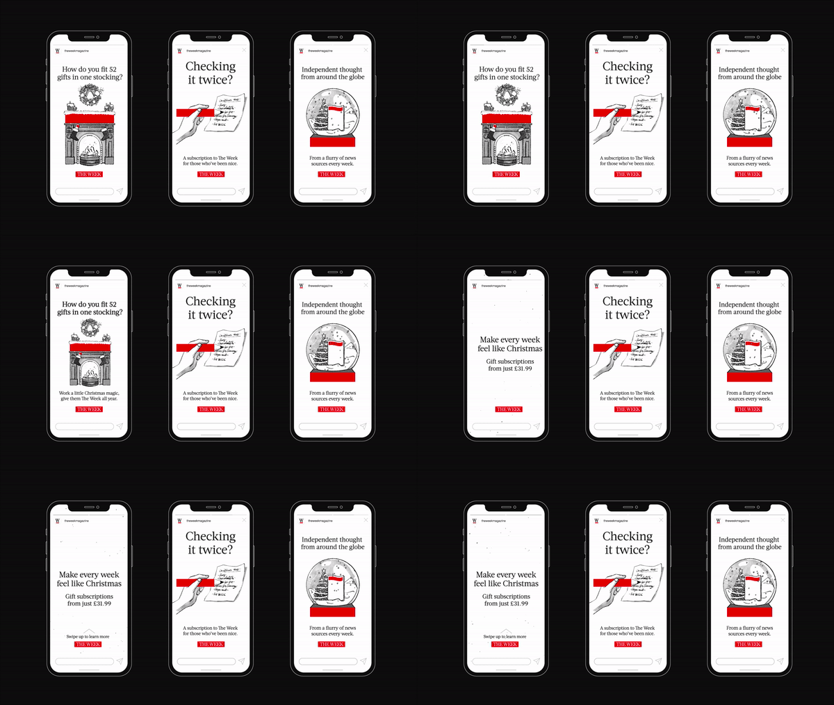
“We worked with Louis to create those very simple black line illustrations, with just a little bit of tone in, to be able to tell stories around the red bar”.
As the recruitment of new and lapsed readers was a priority, Elmwood and Mendo created “scenarios around certain truths about the brand: about where people read it, when they read it and how they read it.” In the illustrations the red bar variously becomes a desk, a dinner table, a bath or a yoga mat. Across digital, animations bring these illustrations “to life”, Lawrence adds.
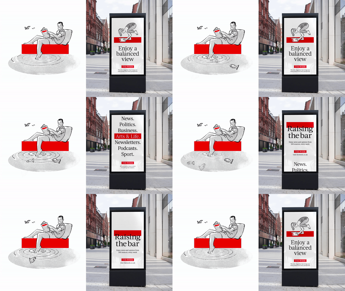
While Elmwood also worked on specific campaigns such as the upcoming Christmas campaign, Lawrence says that the “core of the project is around [creating] iconic assets and design working hand-in-hand with great copy.”
He says that although Elmwood works with writers for design, he likes to encourage the design team to “[not] use Loren Ipsum. […] you’ve got to think about how you’re putting the words and the illustrations and the assets together and have some fun with that as well”, he says.

In terms of working with existing assets, Lawrence explains that the masthead has the type “set high within the red band to accommodate the month and price”. Elmwood centralised the wordmark for its use “off-pack”.
“The goal over time”, Lawrence says, is to build recognition so that the logo doesn’t even need to be present, with the red bar becoming “meaningful and memorable” in itself.
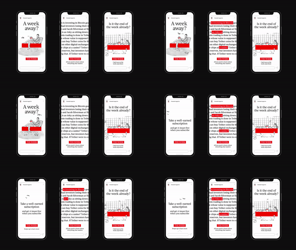
He describes the focus on the red bar as something “so single minded” that it becomes “the gift that keeps on giving”. Its simple colour and shape mean “your imagination is allowed to run riot with what you can build around it”, he says.
“We wanted something which was easy for people to pick up”, and for the Week’s creative team to “have some fun with it”.
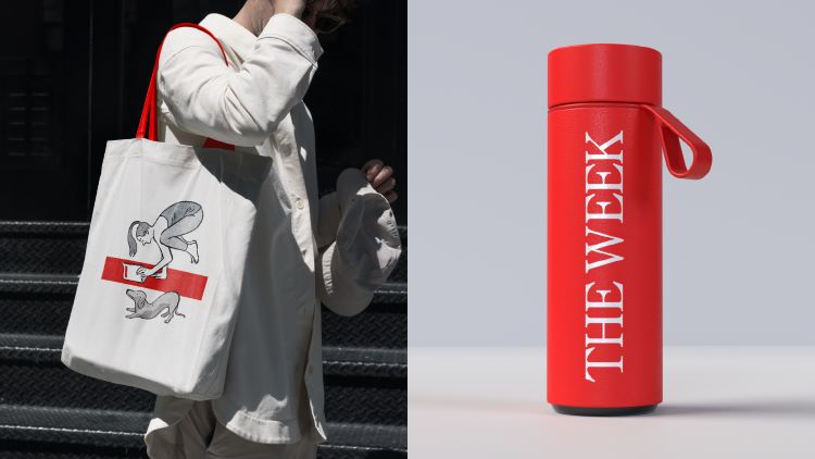
Ed Craggs, head of marketing at The Week comments, “The simple, scalable approach Elmwood designed provides a powerful tool to cut through the clamour. Stylistically, the design system they created echoes The Week’s own skill for balanced, yet quietly charismatic, storytelling.”
Lawrence describes it as an example of designers “doing more with less”. “You’re more salient, you’re pithier, you’re cleaner in what you deliver […] because you know it needs to be identifiable in the blink of an eye”, he says.



My problem with The Week is its choice of glossy paper and small font sizes. Both make it less than an easy read in our kitchen.
No mention of the brilliant ‘The Economist’ red campaign, created by Abbott, Mead, and Vickers, with outstanding copywriting by the late, great David Abbott (just one example: “Well-written and red’) ‘The Week’ is a pale imitation of Abbott’s influential work.