The power of punctuation: Michael Arndt on his new book Snails and Monkey Tails
A new visual guide by graphic designer Michael Arndt explains the origin stories of punctuation and how designers and typographers can incorporate it into their work.
You might look at the title of graphic designer Michael Arndt’s most recent book and wonder how snails and monkey tails have anything to do with punctuation. The main title is “curious enough so that most people won’t get it”, says Arndt, which is why he included the subtitle, A Visual Guide to Punctuation and Symbols.
If you are curious enough to read on, you would learn that snail – or chiocciola in Italian – is the nickname for the “at” sign (@) in Italy, while in Germany they call it Affenschwanz, which translates to monkey’s tail.

Arndt says he took his cue from films, “starting at a weird spot”, followed by the credits (the foreword and preface), before getting into the main event. When he first had the idea for the book, it was intended for children, so having “two fun animals” that were “very visual”, with the added bonus of alliteration, seemed like a “charming way to get into the subject matter”, he explains.
Inspiring a younger audience
The book began to form when Arndt was talking to an editor who published children’s books about the origin of the hash sign (#), a story which he dedicated the most space to in the book. The hash sign – also known as the pound sign, the number sign and the octothorpe (for its eight sides) – has the same origin as the British pound sign and the Italian lira.
All of the symbols originate from a Roman unit of mass, the Libra Pondo, meaning “a pound by weight”, with both the pound and lira originally taking their value from a pound of silver. The book details that pondo gave us the word pound, while the word libra was abbreviated to lb (which we now recognise as a weight measurement) and adapted to create the British pound, the Italian lira and the hash sign.
The editor asked Arndt to draw up some sketches but as he was doing them, he says he realised it was “probably too complex to be a children’s book”. He went ahead with the book anyway, deciding that it would be a visual guide suitable for people of all ages and professions, particularly for designers.
“Separating a good designer from a great designer”
The nature of Arndt’s job as a graphic designer requires him to look at letter and logotypes in more detail than most. He says he has become “hypersensitised to typography” and how it translates physically and digitally, adding that “punctuation is a big part of it” despite it not getting much attention in design school.
Arndt believes that this “extra attention to detail” when it comes to punctuation is what “separates a good designer from a great designer”. He explains that often people think “if it looks right, it is right” but, while it might appear correct when applied in one typeface, changing the typeface might alter its appearance.
According to the book, one example would be the Em Dash – which in some typefaces appears to be the same width as an uppercase M – a symbol that is often substituted with two hyphens. In some typefaces, it may appear as one long dash but in others it becomes separated by a tiny gap, making it incorrect in any creative or editorial setting.
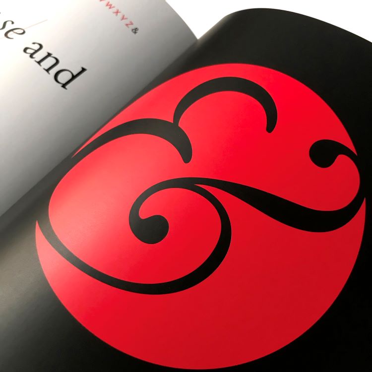
Typography more drastically influences other punctuation symbols, such as the asterisk, which Arndt says can have between five and ten points depending on the typeface, and can be “rounded, triangular or pointed”. Another symbol which changes with the typeface is the ampersand, for which Arndt says there are “so many different varieties”.
The ampersand is derived from the word et in Latin, but it later evolved into a character comparable to a figure of eight, recognised and used by most younger generations as that is how it appears on keyboards. According to Arndt, “in some typefaces it still looks like an et” and in others it resembles a plus sign (a symbol that is also derived from et). He notes how evolutions of symbols have affected how we understand the written word, explaining how “150 years ago it was totally acceptable to write etc as &c” because it was more widely known that the ampersand symbol stood for et.
Sometimes when creating wordmarks, a designer might choose a typeface specifically for how the punctuation looks if it’s a main feature of the word, such as the identity for the Brighton & Hove Museum, where the ampersand is used as a graphic device.
Designing the book
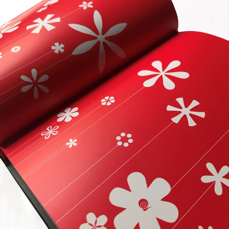
While Arndt often opts to use bold, engaging graphics in his books, he describes how it was particularly important for Snails and Monkey Tails. Usually, punctuation is quite small and unobtrusive but on the pages of this book they appear much larger and clearer with the type remaining small. Arndt calls this the “Alice in wonderland approach” to graphic design, where small things become “gargantuan”.
This enlargement of punctuation is used right from the cover, “already telegraphing to the reader that the book will take a detailed zoomed in look at punctuation”, says Arndt. He adds this technique also symbolises how the book will “elevate the importance of punctuation in your mind” by the time you have finished reading it.
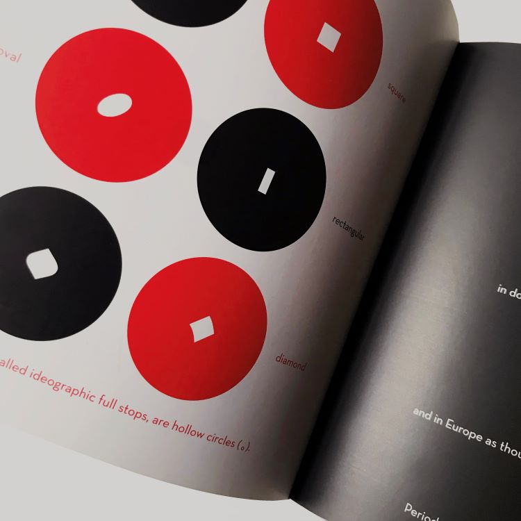
Highlighting the beauty of punctuation by “blowing it up” should let the reader see details that “only a graphic designer would note”, says Arndt. Full stops (also known as a period) are not always circles, depending on the typeface, but this is hard to notice because of their minute size. According to Arndt, you can identify typefaces through these “peculiar idiosyncrasies”. For example, in Helvetica full stops are square, in italic font they might be more of an oval shape and in script fonts they appear in an “organic diamond” shape.
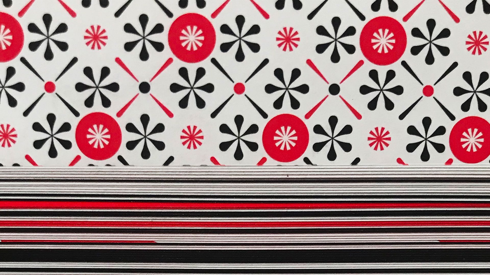
The only colours that feature in the book are black, white and red, which are used fluidly across text and images. Arndt says that he chose red as the third colour because of the role it has played in certain punctuation origin stories, such as that of the pilcrow. Pilcrows were marks in the margins, sometimes slightly indented—or even occurring in the middle of the paragraph—and often rubricated (penned in red) by medieval scribes.
The scribes also did the embellishment of the large, illuminated initial letters of a first paragraph. It was these initial capital letters that were mainly responsible for the indentation being left blank – after the printing press became more widely and scribes could not keep up with the rate of printing – and therefore why we indent paragraphs today.
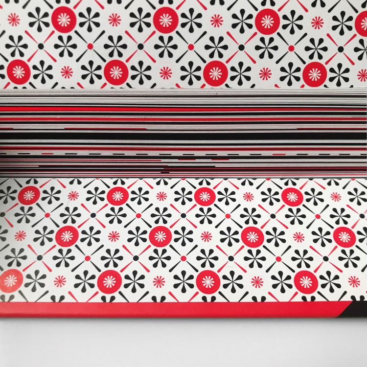
Despite there being a grid layout for the book, Arndt says that “no two spreads are the same” because he wanted to illustrate the content in the best way possible for each individual story.
As much as the contents and layout of the book makes it accessible to the masses, Arndt intended for it to engage older kids, teenagers and university students. “There is such a movement now away from punctuation to the point where you come across as rude if you use a period, or if you don’t use and exclamation point it comes across as cold,” says Arndt.
One of his hopes for the book is that it will “ignite a passion” in Gen Z and the generations to follow, which will ultimately help them to “clarify their communication”.
Snails and Monkey Tails: A Visual Guide to Punctuation and Symbols was published in the UK by HarperCollins on 8 December 2022
-
Post a comment
