The best book cover designs of 2022 revealed
The Academy of British Cover Design reveals its winners of the year, as well as the best design from the last decade, chosen to celebrate the “irreverent” and “inclusive” awards’ 10th anniversary.
The Academy of British Cover Design (ABCD) has revealed its winners for the best book designs of the year in addition to a special competition for the “winner of winners” to celebrate the tenth year of the competition.
Founded by book designers Jon Gray and Jamie Keenan, the awards was set up ten years ago as an alternative to the existing publishing and cover design competitions. The “pompous” name the pair chose was intended to signal the tone of the awards, Gray and Keenan say: “Irreverent, self-sufficient, inclusive and (most importantly) a laugh”.
The awards have ten categories, including Sci-Fi Mass Market and Crime Thriller, “categories that had always previously been overshadowed by literary fiction and the trendier parts of non-fiction”, the pair explains.
“Cover design coverage, like publishing competitions in general tends to fixate on literary fiction, despite the huge sales of mass market and children’s books, and the importance of having a diverse range of genres”, they add.
“A voting process borrowed from Eurovision”
That the judges come from book design backgrounds themselves is part of the awards ethos.
Its panel of ten judges includes one judge drawn from each category, and balances five men with five women, Gray and Keenan explain. In “a voting process borrowed from Eurovision”, the judges draw up a shortlist of six for each category, with the exception of non-fiction, which has 12 shortlisted designs.
On the night of the ceremony, those in attendance “view the shortlists for the first time, and using a voting slip, choose our overall winners”.
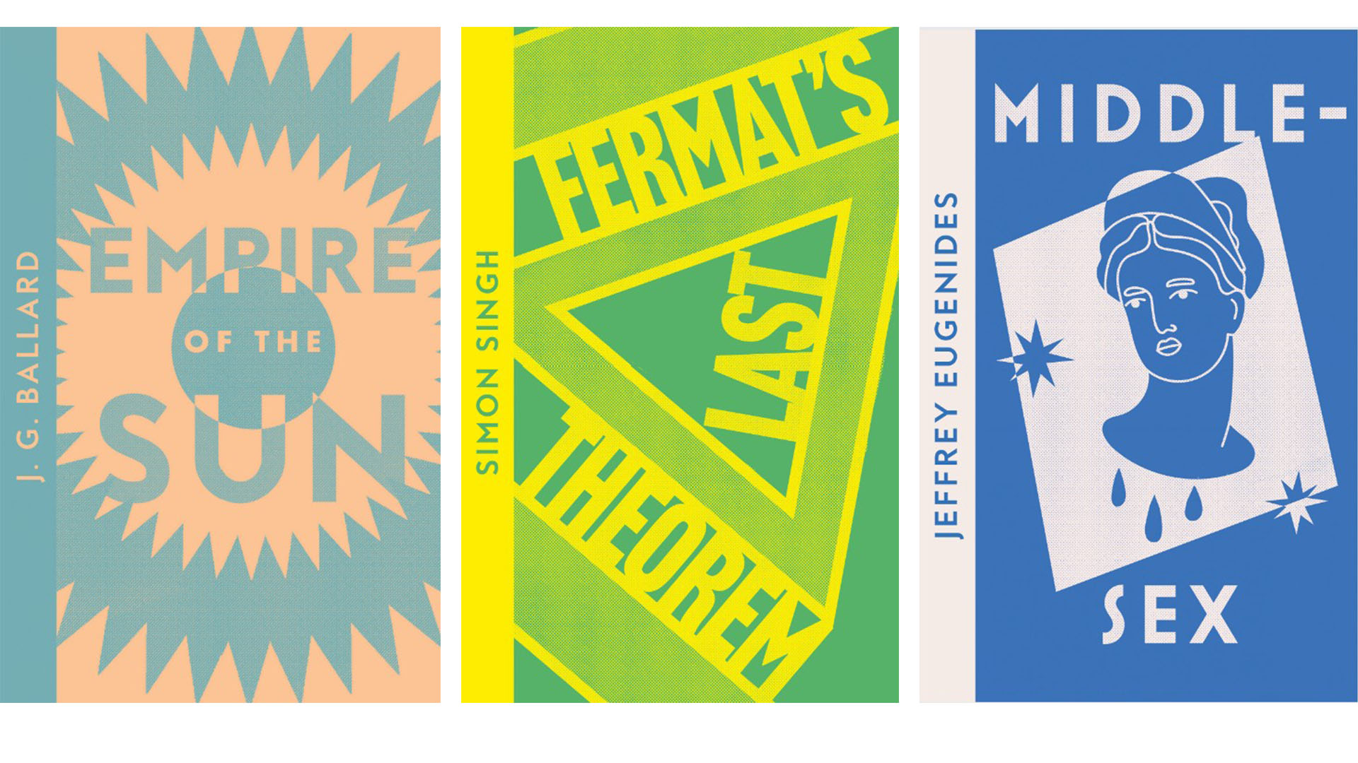
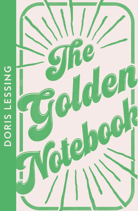
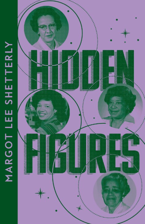
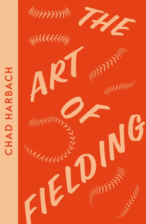
Three covers from the Series category, designed by Jo Thomson
While worrying that the need to “somehow display the shortlists and allow people to vote, and then just have one hour for the votes to be countered before the awards ceremony began”, would be difficult, the awards have gone from “strength to strength” according to Gray and Keenan.
“We now get around 1,200 entries and around 300 people attend the awards evening”.
Category Winners
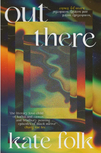
In the Sci-Fi/Fantasy category, designer Lydia Blagden won for her cover of Out There by Kate Folk, published by Hodder Studio.
For the winning design in the Children’s 0-5 category, designer Audrey Keri-Nagy worked with art director Deirdre McDermott and illustrator Jarvis for the cover of his book The Boy with Flower in His Hair.
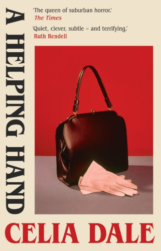
Luke Bird’s design for A helping Hand by Celia Dale, published by Daunt Books won in the Crime/Thriller category. Bird worked with art director Marigold Atkey.
Designer Jo Thomson won in the Series Design category for her designs for the Collins Modern Classics series.
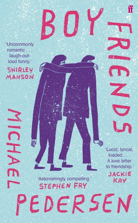
Jon Gray himself won in the non-fiction category for his cover of Boy Friends by Michael Pederson and published by Faber, working with illustrator Nathaniel Russell and Art Director Donna Payne.
Classics/Reissue was won by Suzanne Dean working with illustrator Nakamura Kyoko on the new design for Kafka on the Shore by Haruki Murakami, published by Vintage Classics.
Children’s 6-12 was won by Holly Ovenden, who designed and illustrated the cover for The Chestnut Roaster by Eve McDonnell, published by Everything with Words.
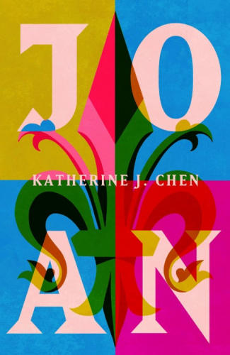
Ovenden also won in the Literary Fiction category with her design for Joan by Katherine J. Chen, published by Hodder & Stoughton.
The best Mass Market design came from Jack Smyth working with Patrick Insole for The Black Dog by Kevin Bridges, for imprint Wildfire.
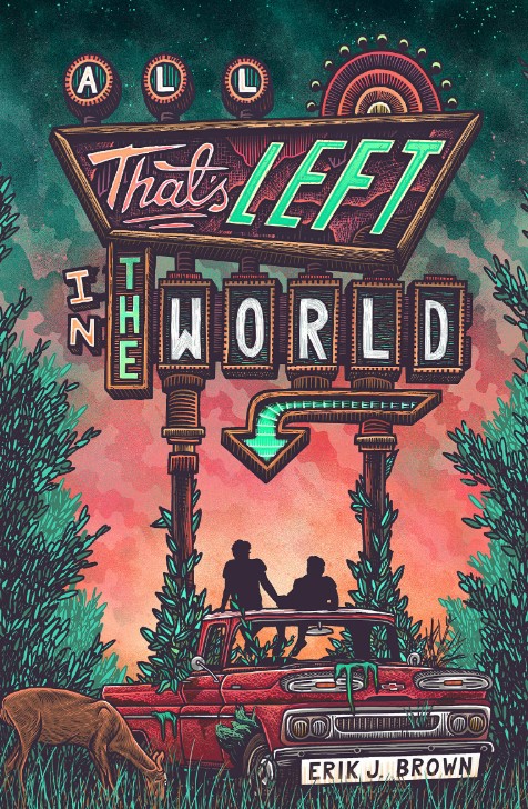
The Young Adult category was won by Michelle Brackenborough, working with Illustrator Luke Martin on All That’s Left in the World by Erik J. Brown and published by Hodder Children’s Books.
Tenth anniversary Winner of Winners
To celebrate the tenth year of the awards, an additional vote selected the “Winner of Winners”. This was won by designer David Pearson, for his 2013 cover of George Orwell’s 1984. Sitting within the Penguin livery, the title and author name are debossed and covered in black foil, appearing as if “redacted”. Pearson explains that this was a reaction to the cover’s claim that this was the “complete and unabridged” version, which felt like a counterpoint to the story of censorship – and suggested Penguin was “somehow complicit in the spread of misinformation”, he adds.
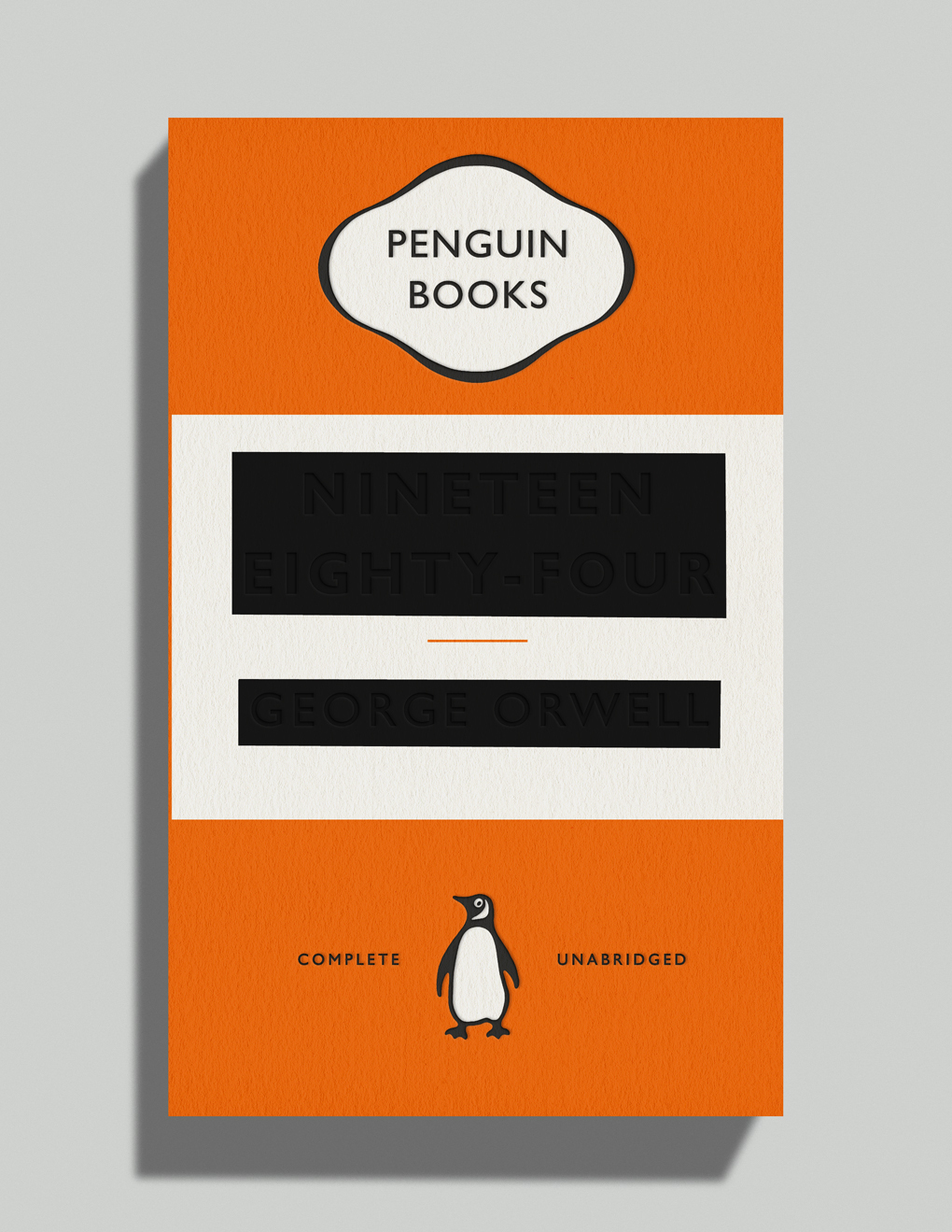
Encouraged in the direction by Penguin Press art director Jim Stoddart, “it felt good to trust the interpretation of readers and to provide further proof that legibility isn’t the only route towards meaningful communication”, Pearson says.
“The book also needed to be well known to get away with this level of subversion: if potential buyers hadn’t read it, there would be a good chance they would still understand the messaging.
“I liked how the ‘complete and unabridged’ line made Penguin look somehow complicit in the spread of misinformation. I have to be grateful to them for allowing such brand abuse.”
All images of this year’s winning covers courtesy of the Academy of British Cover Design.
-
Post a comment
