Delayed Gratification: choosing beauty over the news agenda in cover design
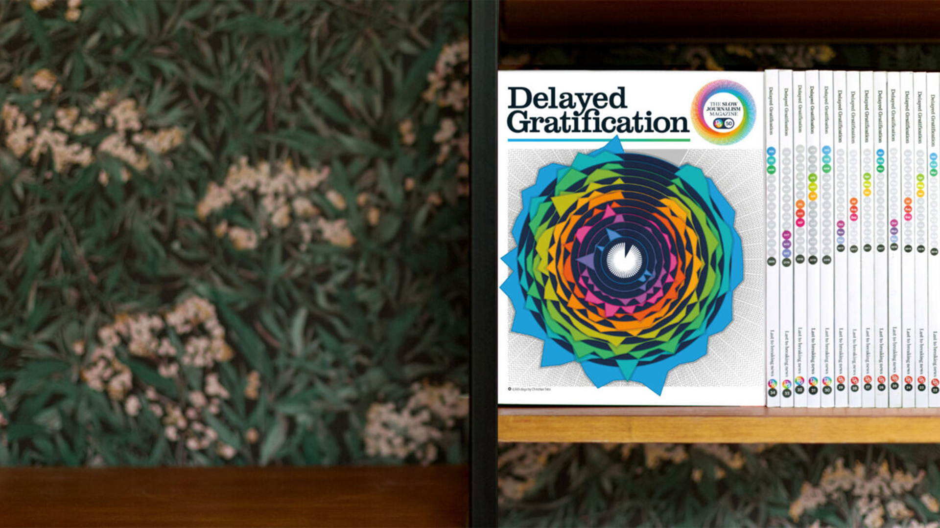
The team behind the slow journalism publication discuss what makes a good cover and why the 50th issue breaks the rules, with an infographic capturing “the great sweep of slow journalism history”.
“We had all these high-falutin ideas when we started the magazine”, says Delayed Gratification co-editor Marcus Webb.
“One of the ideas we were talking about was like a Bayeux Tapestry to capture the months like a tableau, and have some things being passed from one cover to another, so you could stack them up and make this big tapestry of life.”
After presenting this idea to art director Christian Tate, he explains, “Chris immediately said ‘that’s probably a bit complicated’”.
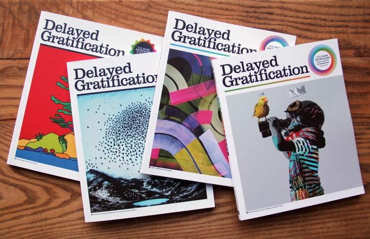
Perhaps unsurprisingly, the team went for a different approach. Across its 50 issues, each cover of the quarterly print magazine has featured a work by a different artist, who is also interviewed in the magazine.
“I guess we’re probably a weird magazine in that the covers don’t relate at all”, Tate says.
“When I came to design the magazine, Marcus and Rob explained to me that they wanted something on the cover that didn’t have to tie into the news, because that always sets the agenda of being a lead story”, says Tate. “We wanted something that was totally different – just a nice, beautiful cover”.

When there’s a particularly big event – Brexit, Trump, or Covid-19 for example – the cover might look to reflect the mood, “but most of them we deliberately try and keep quiet and abstract”, Webb says.
“I tend to go off and look for a huge amount of artworks, create a whole load of dummy covers and send them off to Chris or Rob [Orchard], who’s the co-editor of the magazine”, he adds.
While at the beginning this process involved “a big wide trail”, Webb says, now the team is quicker to identify an artist who might work well for a cover. And despite each one being produced by a different artist, “they feel like a part of something”, Webb says. “A lot of people are quite surprised when they find out it’s different artists each time”.

“I think for me the ones that really work well have big, bold, graphic colours”, says Tate – such as Michael Craig Martin’s metronome image for issue 16.
“They match the tone of the magazine, but it’s nice to have a break from that occasionally – like when we had Grayson Perry’s cover, which is really intricate, very involved work”, he adds.
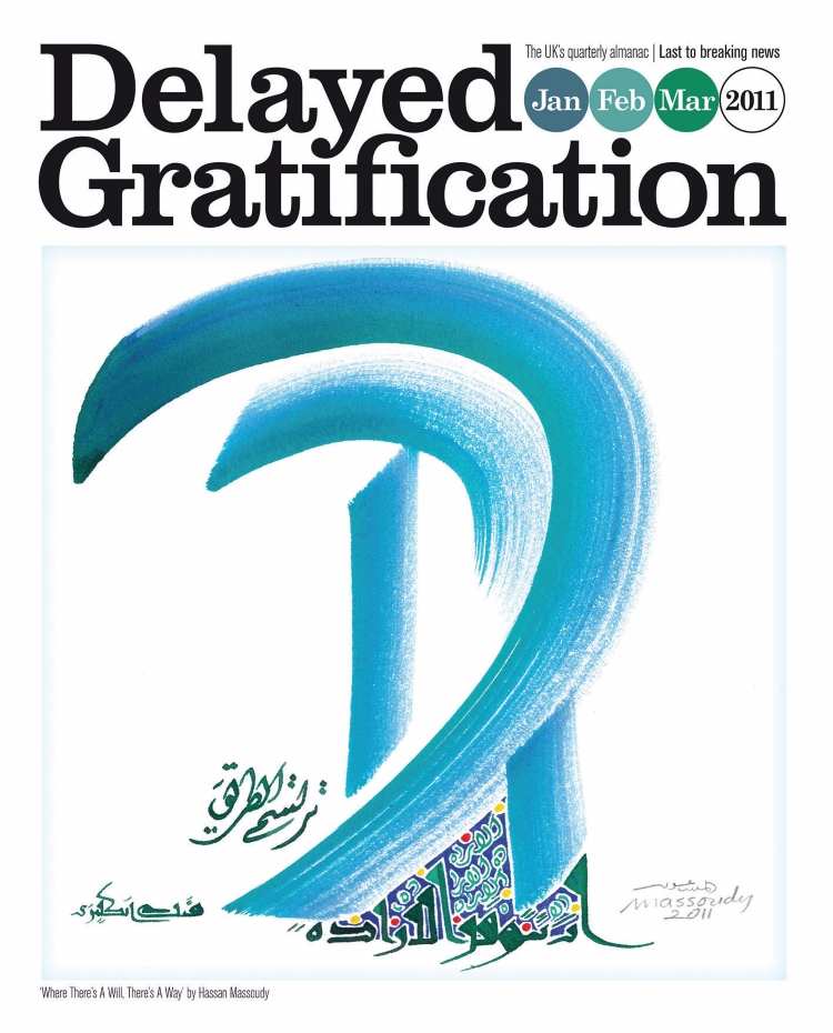
Another highlight, suggests Webb, was the cover of the second issue, by Iraqi calligraphy artist Hassan Massoudy.
“That was right back in early 2011, so the Arab Spring was just starting”, Webb says. “We approached him and he was a fascinating interview, but also created this cover, called Where there’s a will, there’s a way – which really spoke of it.”
Other covers have come from Morag Myerscough, Jen Orpin and Ai Weiwei just to name a few, but the artist who has created the most for the magazine is American artist Shepard Fairey, whose work Tate describes as “a great kind of documentary of the era”.
“It’s kind of luck that we managed to get him for the first one, and then he said yes to do it for the 5th and 10th birthday [issues]”, Tate says. Even more generously, he says, “he also let us produce limited edition prints of the first cover”.
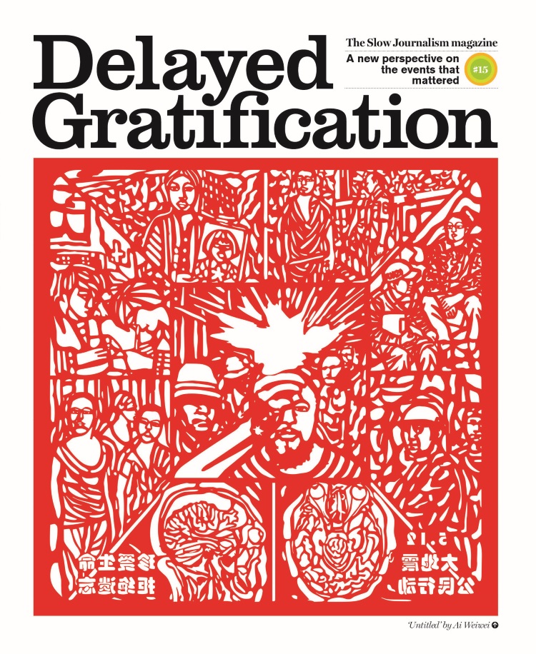
As for why art, unlike the illustrations favoured by some other publications, Tate says: “With illustration, you can take it on a tangent, but I think there is always quite literal interpretations there. Whereas with the art, we can just literally do anything we want, without having to justify it at all.”
“Apart from that it’s beautiful and it looks nice on the news stand or on someone’s shelf”.
Issue 50: “Doing everything we tell people not to do”
With issue 50, as the run of the magazine approaches 13 years, the editors asked Tate to design the cover artwork for the first time, realising that no one would “know the brand as well or be as passionate about it”, Webb says.
Tate created an infographic that takes on the somewhat daunting task of reflecting the breadth of Delayed Gratification’s content to date.
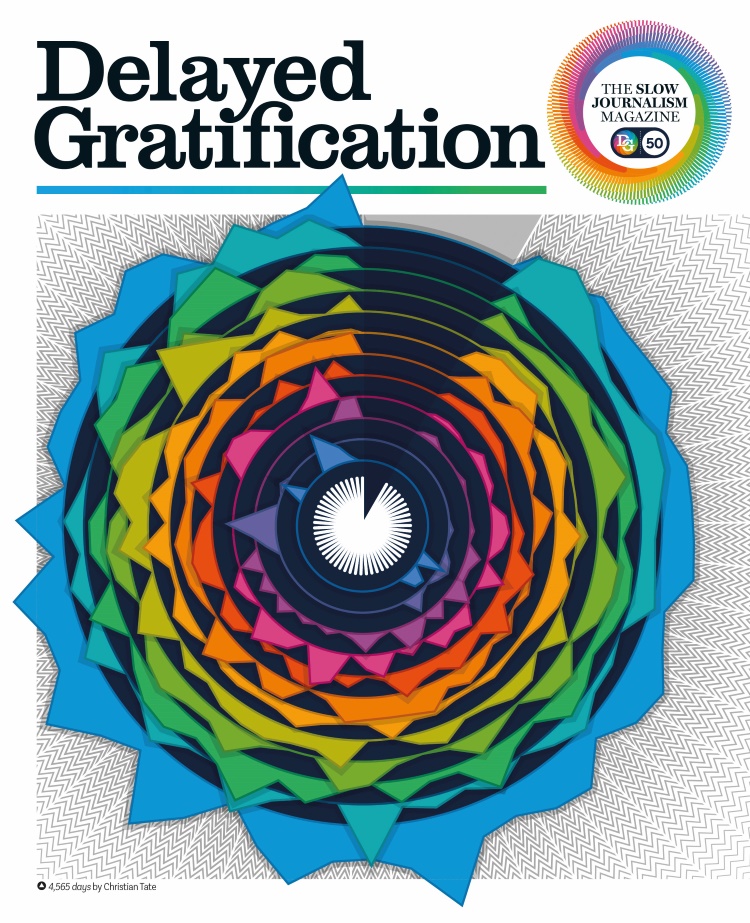
“We’ve done infographics right from issue one and Chris has been the designer of pretty much every page”, Webb says. Of the infographics, many of which were collected in the 2021 book An Answer for Everything, Webb adds: “Some of them are artworks in their own right”.
“We put [the topics] into themes so you can see this great sweep of slow journalism history” Webb says. “You can see stories come in like the war in Ukraine, which we first started covering back in 2014, and when the pandemic started”.
When Trump was elected, he says, “you see this big spike in US coverage”, while he notes that pre-Brexit the magazine didn’t tend to cover the UK much.
“The other weird thing about the cover was that usually when we do an infographic and when we teach it in our infographic classes, it’s got to be useful rather than pretty”, Tate says.
“But this one has to be pretty first, rather than useful. It’s like working backwards and doing everything we tell people not to do”, he says.

The team created 12 categories in total – ranging from crime and terrorism, popular culture to environment and energy – to tally with 12 colours the magazine uses in its design, Tate explains. “We had to do a broad brush with our categories to make it as clear as possible”, he adds.
“I think like all of Chris’ graphics, it’s one of those things that can work on two levels”, Webb says. “You can just have a quick look at it and take it in as a ‘oh that’s interesting’. But if you do want to geek out, you can try and guess what each spike is”.
Other than the infographic, Tate says the team considered “loads of gimmicky things, like having some silver, or embossing, or making the cover dark for this issue. But in the end, we didn’t need all that”.
As for the content, the issue follows its usual plan, but “we have given ourselves a few pages to celebrate hitting fifty”, Webb says, as it’s “pretty rare for an independent magazine to make it that far”.
“We’ve got an interview with Christian talking about the cover and how it’s changed over the years”, and we’ve all picked our favourite feature from the 50 issues, or favourite infographic”, Webb adds.
There is also the hope that new and existing readers might also be prompted to dive back into the archives, Webb says.
While the print magazine already has a digitised archive, launched during COVID-19, the team is currently working on a new app planned for launch later this year. With “audio versions and HTML rather than just PDF”, and designed with advice from the RNIB (Royal National Institute for the Blind), Webb says it hopes to make the magazine more accessible.
With the challenge of intricate infographics and long-form text features, “we’ve always been reluctant to launch an app until it was as good as the print version”, he says, but with the help of web designer and developer Peter Shepherd at C2 Clear Creative, “now I think we’ve kind of cracked it”.
-
Post a comment
