Koto overhauls music streaming service Deezer’s identity with pulsating logo
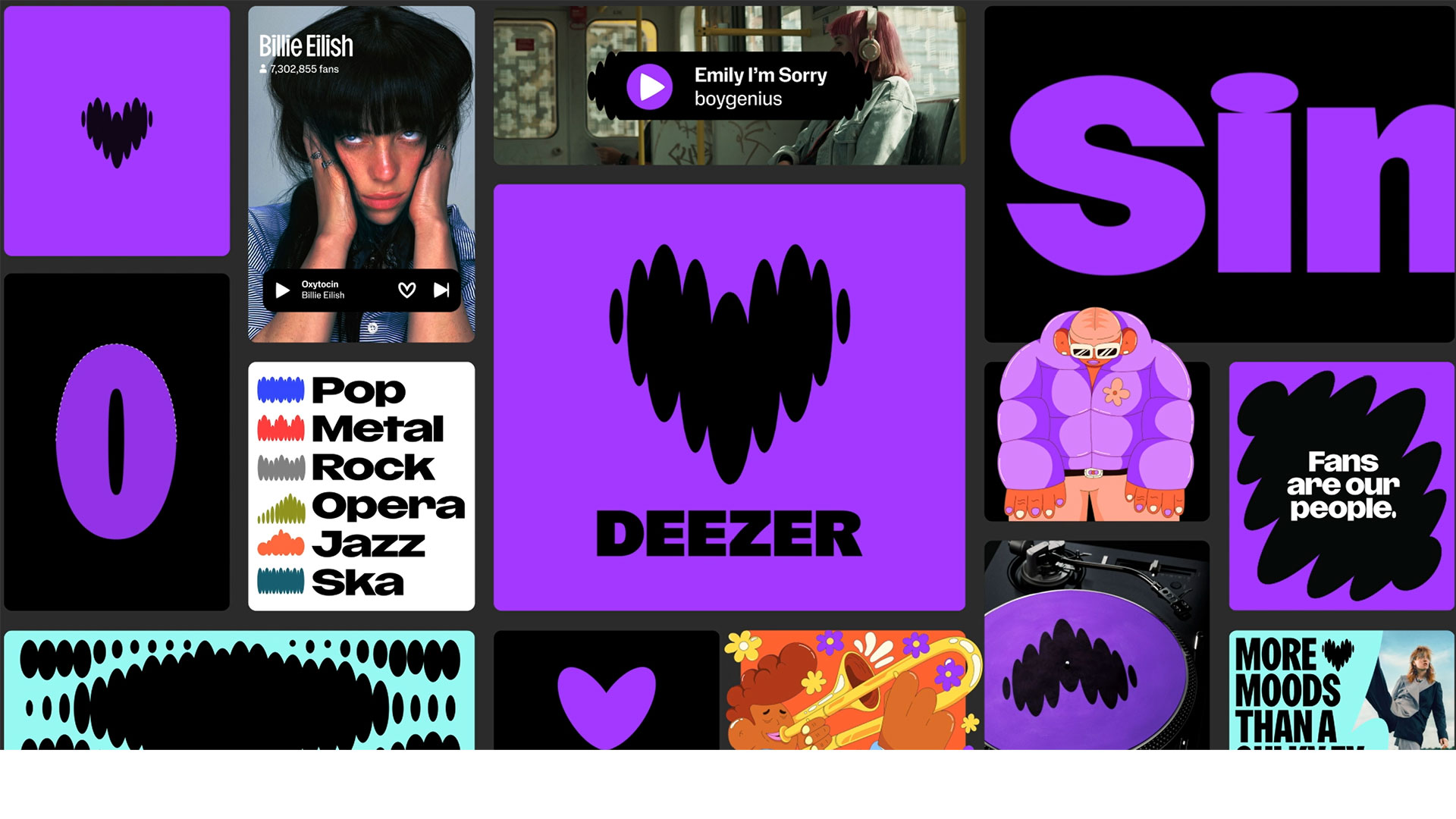
The heart logo has two “dynamic states” to mirror the experience of listening to music and is made up of rounded forms that inspired bespoke headline typeface Deezer Sans.
Koto has designed a new identity for music streaming service Deezer with a “pulsating heart motif”, redesigned logo and bespoke typography.
The audio platform was founded in 2007, has a presence in 180 countries and ten million paid subscribers. Koto has previously worked with the likes of Amazon Music, AMP, Netflix, Sonos and Spotify.

Despite having “a strong brand equity”, Koto creative director Joe Ling says Deezer was keen to undergo “substantial change” and “re-evaluate its core purpose”. According to Ling, Koto confronted three significant challenges: aligning the brand with the “Deezer helps you be and belong” strategy, creating a “cohesive, visual narrative” throughout the identity and user experiences, and establishing its uniqueness in the market with “a distinct colour”.
The latter meant introducing Deezer Purple, a hue that Ling says hopes to be “akin to how Netflix is associated with red and Spotify with green”. When exploring the concept of “Living the music”, Koto devised the “pulsating heart motif”, which Ling describes as “the natural life force behind Deezer’s fresh creative direction”.
The heart logo was designed to represent “love and passion for music” and instil “a sense of belonging in the Deezer experience” while also signifying musical rhythms and beats and mirroring “the human response to the listening experience” through motion. He explains how it has two “dynamic states”, one “grounded in humanity, moving to its rhythm”, and the other “deeply intertwined with music, dancing to the beat”. Both were developed to represent the brand’s goal to deliver “an immersive and interactive music experience”.
The forms and shapes of the logo have been applied elsewhere across the identity as illustrative patterns and graphic elements that house imagery and symbolise genres.
Koto collaborated with NaN type foundry founder Luke Prowse to design the variable font Deezer Sans. Its forms were “directly inspired by the shapes inherent to the brand’s logo”, says Ling, and its “versatility” means it has a range of widths “to cater to diverse brand requirements, whether for marketing materials or playlist covers”.
Condensed cuts are used for more “extensive content” while extended cuts are used for “concise, impactful messages”, he adds. Deezer’s new wordmark is derived from the lead typeface but features customised letterforms, which aim to “set it apart from the rest of the typography”, according to Ling.
He notes that the main challenges of the project were integrating the motion design principles and “incorporating beats in various forms within Deezer’s design system”, as well as ensuring each playlist cover was “unique while maintaining consistency and keeping artists prominently featured”.
Deezer’s art direction centres around two core categories. The artist category includes curated musicians, singers, DJs and podcast hosts, while the fans category represents its “dedicated community of music enthusiasts”, says Ling.
The art direction principles comprise three key elements. The “centre of frame” approach looks to centre artists in visual compositions, “highlighting their importance within the brand’s ethos” while “high-contrast” flash photography seeks to “inject energy into the images, maintaining an unedited, authentic feel”, he explains. A “subtle fisheye effect” was applied in a bid to “immerse viewers in the visuals, generating a heightened sense of presence”, he adds.
-
Post a comment
