Paist’s modular identity looks to disrupt “same-old” toothpaste market
Designed by Two Times Elliott, Paist’s identity features a modular typeface that works in tandem with a bright colour palette and abstract 3D forms to create a unique brand system.
Two Times Elliott has designed the identity for new plastic-free toothpaste brand Paist, with “a structured, clinical typographic system” working in contrast with 3D forms and textures inspired by toothpaste in its various states.
Founded by dentists, Paist positions itself as a provider of natural, sustainably packaged and medically approved toothpaste. In the toothpaste sector, it is often difficult to find a product that is “both packaged sustainably and free from artificial ingredients and additives”, says Two Times Elliott founder James Horwitz.
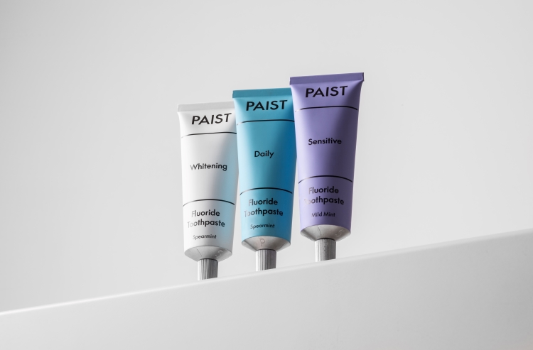
He thinks the toothpaste market is “saturated with a plethora of the ‘same-old, same-old’ red, white and blue toothpaste” and lacks “differentiation or a clear tone of voice”. The brief for Paist encouraged the studio to “explore new avenues for the potential of design, packaging and materiality within a fairly standardised sector”, he adds.
One of the challenges was creating a brand that could stand out in a market that has “an aesthetic that a consumer is so familiar with”, says Horwitz, adding that the studio focused on solving the “challenges” of the brand, rather than conforming to the existing cliches of the market.

In a bid to design “an authoritative, clinical identity” that conveys trust and reliability, while also “injecting a sense of fun”, he says the studio built the strategy around the sense of routine and structure that comes with brushing teeth. As such, the identity plays on the way oral hygiene rituals bookend the day through a structured, modular typographic system using a dynamic, adaptive sans-serif Humanist typeface called Supreme.
A pale purple, turquoise and white colour palette looks to juxtapose the more clinical nature of the typographic system while breaking away from the toothpaste industry standard of blue, red and white.
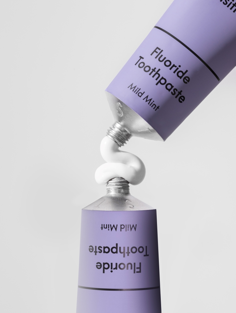
Where the type gives structure, Two Times Elliott aimed to add a further “layer of character playfulness and energy” to convey the “everything in-between” times in the day, says Horwitz. This energy is conveyed through Two Times Elliott’s use of “tactility, movement and unpredictability” in shapes and textures. The studio designed 3D forms and textures inspired by toothpaste in its various states – paste, foam, and water – to “overlay and disrupt the modularity of the type system”, according to Horwitz.
With the packaging, Two Times Elliott sought to convey “a sense of honesty”, prioritising clarity and avoiding “gimmicks and clutter”, says Horwitz. He adds that one of the project’s biggest challenges was creating packs that were reductive in their aesthetic, but which also highlight the unusual form of the product itself and celebrate its 0% plastic credentials without “shouting about it”. The solution was to use a subtle blind emboss that references the tube’s form “without the need for bold messaging”.
-
Post a comment

