Pentagram’s Reddit refresh aims to unite cohesion and “creative spirit”
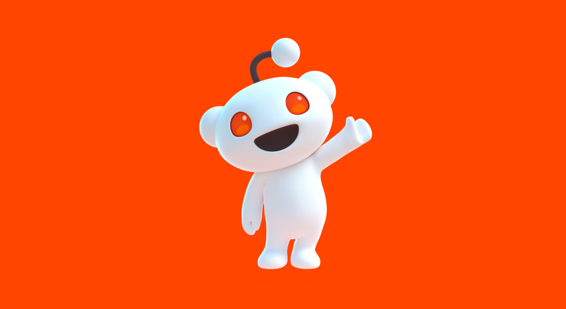
Pentagram New York has refreshed the brand identity for Reddit, aiming to make its Snoo mascot “as iconic as Super Mario”.
Reddit’s brand refresh – one of the site’s most holistic and comprehensive overhauls in its history – saw Pentagram New York partner Natasha Jen’s team introduce a new custom font family, Reddit Sans; streamline its colour palette; and transform its central mascot, Snoo, into 3D for the first time.
The online community forum behemoth approached Pentagram New York late last year with a clear brief: the brand’s global expansion meant fresh eyes were needed to bring clarity and cohesion to the wealth of disparate branding elements amassed over the years.
“Delightfully absurd”
While the paramount consideration was creating a more integrated, intuitive, global brand identity; Pentagram says that it was also vital that the brand refresh maintained “Reddit’s creative spirit”. It continues, “Reddit has a distinctly genuine sensibility to it, expressed in the forms of unique features on the platform and an alien mascot. It also boasts an unusually curious, informed, and active community base.”
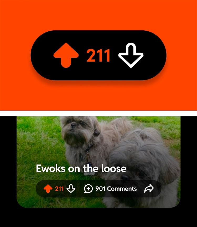
A key challenge for Pentagram was in navigating the complexities of Reddit’s unique terminology, such as its ‘r/’ prefix for subreddits (communities within communities); and the content rating functionality in which users (‘redditors’) either up- or down-vote content, ultimately dictating how widely posts are seen.
During the strategy phase, Pentagram identified four key Reddit ‘traits’, which in turn informed the new brand strategy and visual assets: “inherently eclectic, positively different, delightfully absurd, and genuinely candid”. From there, Pentagram distilled Reddit as being “the heart of the internet”.
 Taking Snoo into 3D
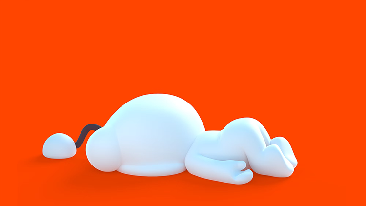
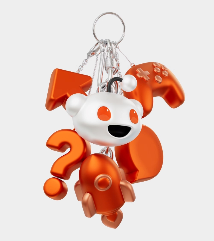
One of the biggest changes to the visual identity is seen in Snoo, who is now 3D and has opposable thumbs. Snoo is accompanied with a new menu of emoji-like Snoos [which] “open the door for the character’s next act,” according to Pentagram.
Snoo’s newly “malleable” face is inspired by Mario’s character design and the aesthetics of films including Turning Red and The Bad Guys. Companies like Nintendo “took their characters from pixels to 3D without losing their spirit and personality, building them up in the process…” says an inhouse Reddit art director, writing on the platform under username Acidtwist.
 The art director adds that Reddit wanted users to “write Snoo’s story together”, meaning its designs are accessible online in a format compatible with open-source gaming software Blender.
While orange-red remains as Reddit’s signature brand colour, Pentagram simplified the brand’s colours from a suite of more than 100 shades to a total of 15, with five primary hues each with three shades. This aims to strike a balance between allowing for community expression and forming a coherent, clear brand identity.
An “iconic” bubble graphic device
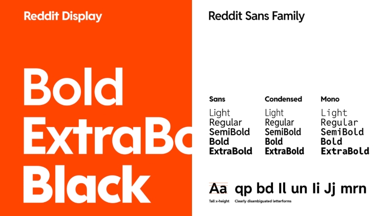
As with Snoo’s design, Reddit’s new custom brand font family – which currently comprises Reddit Sans, Reddit Mono, Reddit Display, and Reddit Sans Condensed – is also open-source and free online. Reddit Sans’ letterforms use distinctively rounded counters in its lowercase so that the negative spaces take on the shape of a speech bubble – an icon that became “a new cornerstone of the brand’s visual identity,” says Pentagram.
The bubble motif is exaggerated further in Reddit Display, which was created to use in headlines and for large-scale copy. “This strategic design move ensures that the iconic shape becomes a recurring and memorable feature in Reddit’s visual communication,” says Pentagram.
The consultancy adds that the bubble also “became a key element of the compositional strategy” in its use as a dynamic content device that can be used to frame text or images. The adaptable bubble graphic device “underscores and celebrates the essence of Reddit’s communities, content, and unique vernacular,” says Pentagram.
In motion, the bubble can stretch and contract according to things like subreddit names; as well as containing layers of content like photography and display copy. “These motion behaviours mimic sliding drawers and doors, and give Reddit’s team a methodology for organising and revealing content in a codified way,” says Pentagram. “It creates clarity, which means the Reddit community can navigate and engage with content more intuitively.”
 From confusion to cohesion – a brief history of Snoo
Snoo (a “time-travelling alien”, according to the brand), has been in place since Reddit was founded in 2005. The company’s co-founder Alexis Ohanian claims he drew the historically genderless, colourless creature as a doodle in his notebook margins during a marketing class as part of his undergrad studies at the University of Virginia. The name Snoo is a play on ‘what’s new’ when abbreviated to ‘s’new’. In the first six years of the site’s life, Reddit’s wordmark underwent numerous changes in terms of its typography and colour; and even changed its spelling on more than one occasion.
In 2018 Reddit unveiled its first site refresh in a decade. Designed by the brand’s inhouse team, the new site was accompanied with brand guidelines that formalised Snoo’s appearance. These dedicated that Snoo must have ears but no fingers, with eyes orange-red eyes (hex #FF4500) sitting in a head that “should always appear blank or neutral”.
Yet another set of brand guidelines was cerated in 2020, this time setting out Snoo’s purpose as representing “Reddit’s friendly, conversational community aspect”. The primary brand colour remained, but this time as the character’s background rather than eyes, “chosen for its vibrancy and distinctiveness,” according to Reddit. “The Snoo head is always blank, like a canvas,” the brand continued.
These ongoing tweaks to Reddit’s assets and design had meant that Pentagram’s initial task in this new project was to evaluate the brand’s positioning with “fresh eyes,” says the consultancy. From there, Pentagram says it created “a cohesive set of brand methodologies for the future—all while preserving the company’s signature sense of conviviality and joy”.
-
Post a comment
