“Beauty, longevity, flexibility”: the National Portrait Gallery’s new visual identity
Edit Brand Studio reveals how the rebrand of the gallery features graphic and digital applications of the Grade I listed building’s physical characteristics and contents.
The National Portrait Gallery has launched a new visual identity, designed by Edit Brand Studio, ahead of its reopening in June 2023.
Edit Brand Studio won the project via an open public tender process. According to the studio’s managing director Khadija Kapacee, it has also had a long-standing relationship with The National Portrait Gallery, working with the institution to produce “brand and exhibition campaigns as well as a number of project identities for their national programme”.
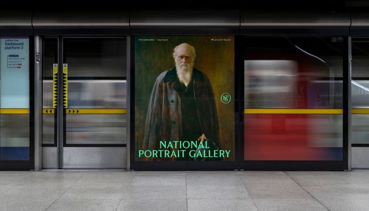
Research carried out by the gallery following its closure in March 2020 revealed that, while visitor satisfaction levels were high, people felt that the collections were not being brought to life as they could be. The fact that the gallery was closing for a three-year period presented Edit with “a blank sheet of paper” and the opportunity to “to reimagine its entire brand and experience”, says the studio’s creative director Karen Hughes.
She adds that a key focus was creating a visual identity that embodies “beauty, longevity and flexibility”, fitting with the historic works and Grad I listed building as well as the contemporary collection and exhibition programme. Edit took cues from the gallery’s recent physical transformation carried out by Jamie Fobert Architects as well as historic details found in mosaics and typography in the building.
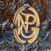
The National Portrait Gallery’s initials now appear as a neat motif across physical and digital brand assets, such as the website and membership cards. Hughes says the NPG initials have been “part of the gallery’s visual and architectural history” since it was built 165 years ago, and can be seen everywhere from the metalwork of railings to embellishments on furniture.
The new monogram was inspired by an original sketch discovered in the archives, which was drawn by the gallery’s first director, Sir George Scharf, in 1893. The modern reimagining of the sketch seeks to bring it life while “retaining its original beauty and simplicity”, Hughes explains.
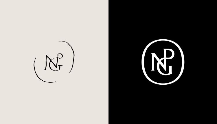
Edit Brand Studio brought in illustrator and typographer Peter Horridge to redraw the mark with a contemporary twist. Horridge has drawn logos and crest for many institutions, including the Royal Household and King Charles, Liverpool Football Club, and the Liberty department store.
Horridge also drew the gallery’s new bespoke logotype, which was designed to work cohesively with NPG Serif, a bespoke typeface created by Monotype. Both the logotype and typeface are rooted in historic fonts found across the gallery, making them truly unique to the brand. Hughes says an effort was made to “balance classic and contemporary” in the design of NGP serif, which also incorporates characteristics of “contemporary serif typefaces”.

Edit sought to “re-energise” colours found on the gallery walls and original paint pigments through the brand’s colour palette, says Hughes. The primary palette comprises five more vibrant colours and a warm grey, which can be applied in various tints. Hughes adds that the aim was to “provide flexibility whilst creating consistency and synergy” between the space and the branding.
Leeds-based digital agency Numiko worked collaboratively with the National Portrait Gallery’s in-house digital team to design its new website, which aims to improve the user journey and use imagery more prominently. The gallery was able to optimise its website through Bloomberg Philanthropies’ Digital Accelerator for Arts and Culture programme, which aims to advance arts organisations through strategic improvements to technology infrastructure. The programme was launched in 2021 to help cultural institutions that were affected by COVID-19.
The National Portrait Gallery’s website has now launched, with physical applications of the identity to roll out over the coming months as the reopening date approaches.
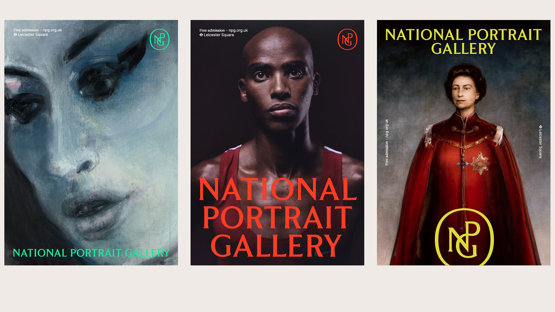


Edit Brand Studio has created a simple elegance for this much-loved institution. It harks back to the more classical styles evident in the 1920s – 50s before modernism dominated the graphic scene, and is also apparent in the world of today’s book cover design.
“inspired by an original sketch” – or – is the original sketch?