Sarah Hyndman: “Punk was the anti-Helvetica”
Typographer and graphic designer Sarah Hyndman, author of Why Fonts Matter, will be giving a talk this month about the power of typefaces in the punk era, part of the current Graphics of Punk exhibition on at the Museum of Brands.
We speak to her about how punk democratised design, and why Snapchat is the modern-day equivalent.
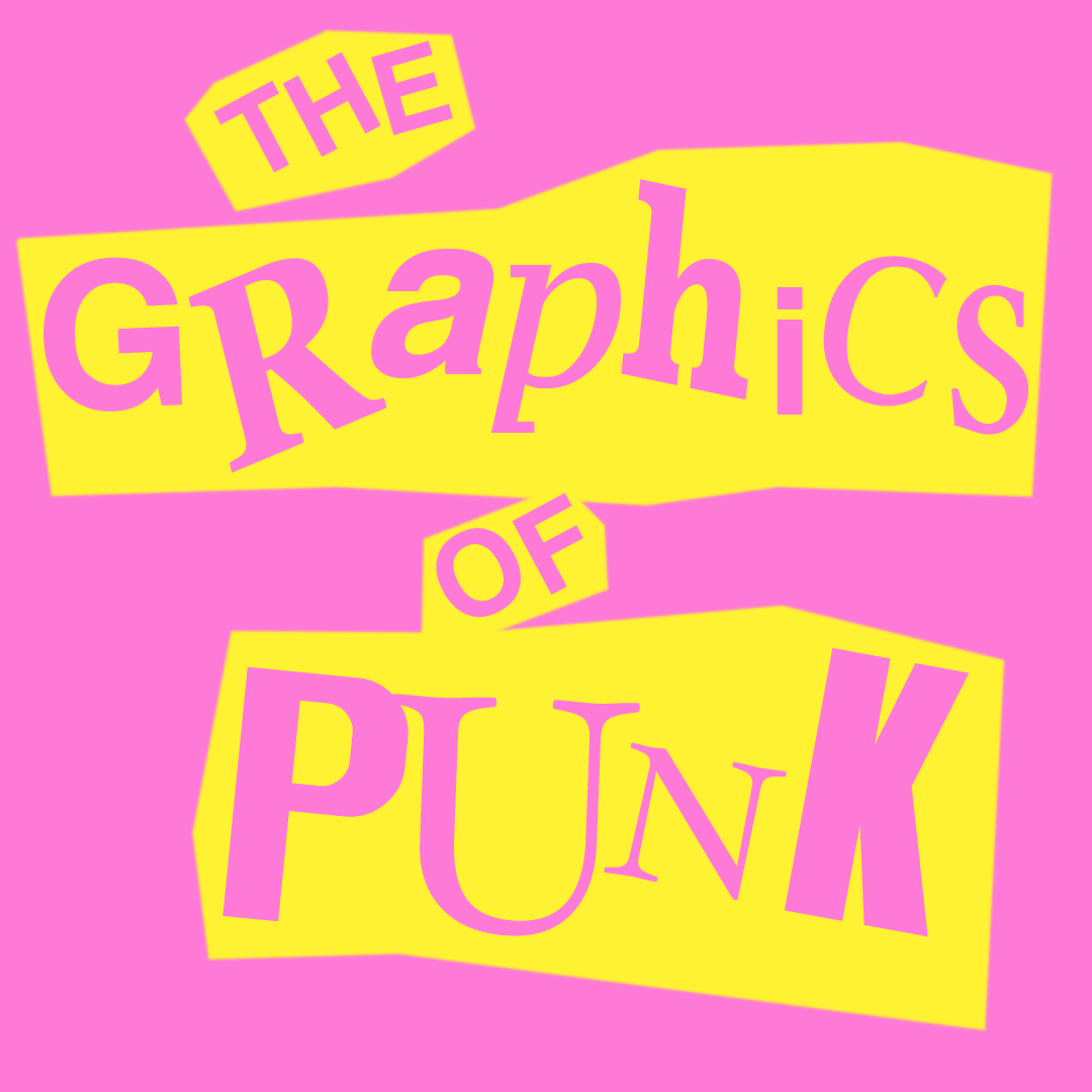
Design Week: Why did you get involved in the Graphics of Punk exhibition?
Sarah Hyndman: Type charts social and historic change. The Museum of Brands is a place where you can see all these voices speaking through all of its products and packaging, which wouldn’t normally be shown in an exhibition because they’re not considered high design. My area of interest is how type is woven into the social fabric of our lives – it’s something that I’m on a mission to democratise.
DW: What will you be talking about in the Never Mind the Typography talk?
SH: It’s an hour-long, interactive talk. I’m going to start by looking at what Britain was like in the early, post-war 1970s – there were a lot of social conventions, and the graphic design community was still besotted by the formality of modernism and minimalism. The UK was also going through a recession and it was a massive time of change. Then punk appeared and completely broke the rule book. It was shocking compared to everything else that was happening.
I’ll look then at how punk gave people a voice. It wasn’t about the designers, or the establishment. This was before Apple Macs were around, so you couldn’t just print your own posters. You’d have to go to a typesetter, and the method would be expensive. Punks ignored all of that and found this really immediate way of disseminating their voices. Punk graphics and typography have become part of the everyday vernacular today, but it was very empowering at the time.
Then I’m going to look at a few different ways this has happened since, and what the new voice of rebellion might be today.
DW: How did punk break the rule book of typography?
SH: In the 1970s, if you wanted anything printed, you’d go to the typesetter. You’d tell them what size you wanted, then they’d punch in computer code, and all this phototype would come out. Then you had to laboriously stick it down.
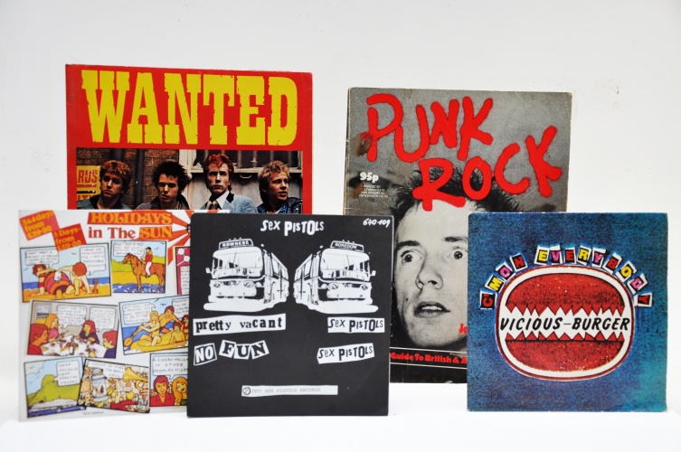
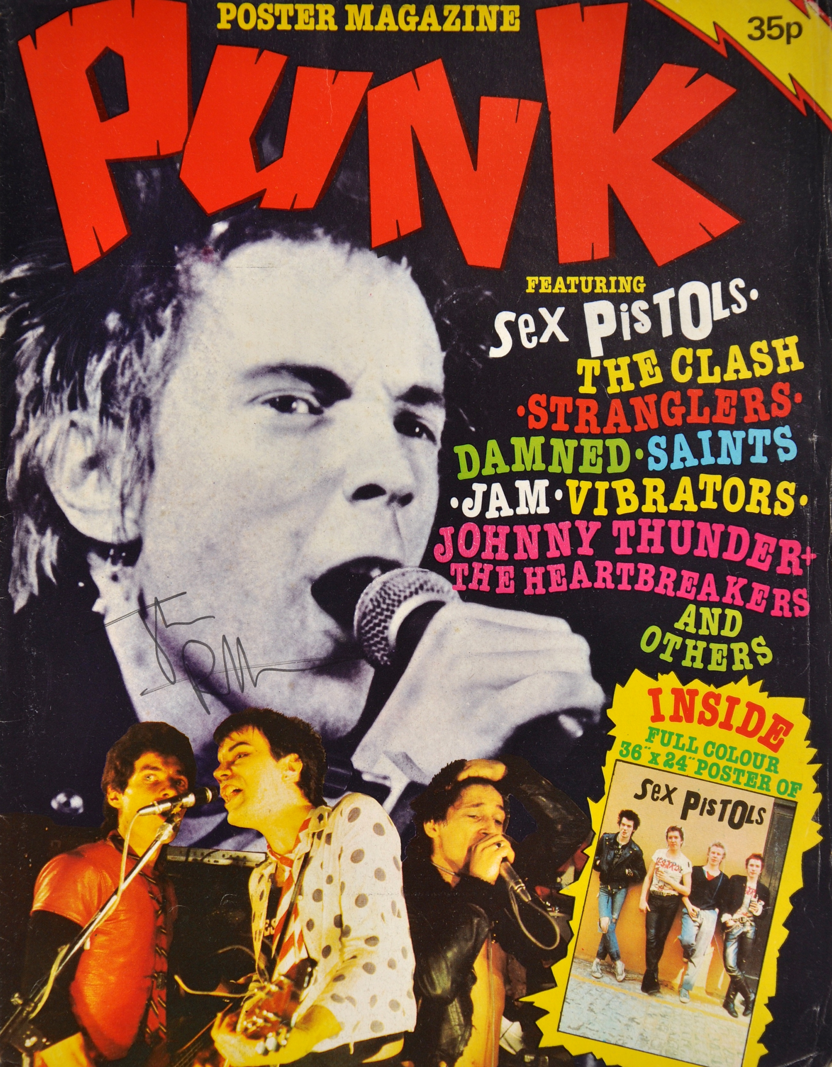
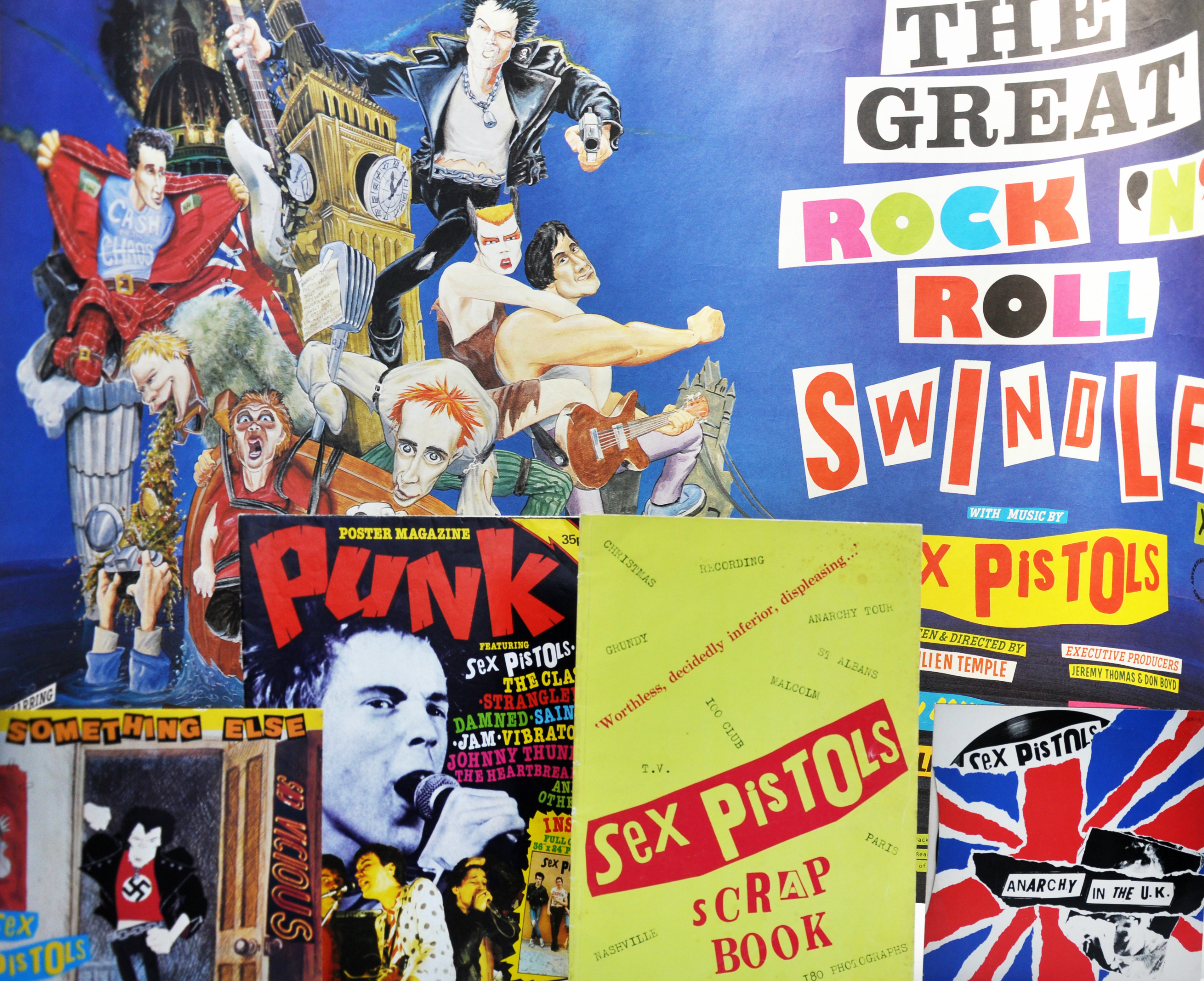
With punk, there were underground designers like Jamie Reid, who did the Ransom Note and Sex Pistols graphics, then there were non-designers making things like zines. They would literally get newspapers and magazines, cut up the types they could find and stick it down. For what they couldn’t find, they just got felt tip pens out and drew it. They then took this to a photocopier at a local library. It was whatever they could get hold of. They didn’t sit there and spend hours typesetting or choosing the perfect cut of Helvetica – it was the anti-Helvetica.
DW: How do you think typography can spark rebellion?
SH: Firstly, the message has to be strong. Type then gives that message a voice. Typography gives your written, printed words the same impact as a physical presence. So if the typography and the design mirrors the message well, it will convey your voice authentically. That will get people’s attention, and maybe motivate them to join your cause.
DW: What do you think are the distinctive aesthetic styles of punk typography?
SH: There was no style– it’s all the types that were being used in the 1970s, but ripped up and mashed together in a mismatching way, then thrown back down on a page with felt tip scribbles. There was definitely no attention to kerning or leading. The theme that runs through is just this DIY immediacy.
It was completely new and innovative but there have been a few times in history where type has been ripped out of the grid and spilled across pages quite loosely and emotionally, such as the Dadaist and Futurist periods. But whereas before, revolutionary graphic posters would have had quite aesthetically beautiful typefaces, with punk it was clashing and obnoxious.
DW: So do you think that punk helped to make graphic design more democratic and egalitarian?
SH: Yes – punk very much started this DIY culture. Apple Macs came out 10 years later, then suddenly there was a whole new generation of people who had access to the same kind of things that punk designers were using. There was a big debate afterwards about ugly design and untrained designers.
DW: What would be the equivalent today of this typographic rebellion?
SH: Snapchat – when you choose your type on Snapchat, it’s really immediate and ugly, and it’s only there for 10 seconds. You’re not setting it, it’s just Times New Roman or Ariel. It’s the closest thing now to what punk looked like.

DW: What do you think are the current trends in typography, and what is breaking the mold?
SH: Typographically, we’ve almost circled back to modernism. If you look at apps, it’s all this easy-to-read, sans-serif, corporate type set in nice lines – it’s all so incredibly similar. So we’re ripe to break out of the grid again. Because web design is still in its infancy, it’s stuck in this safe style. Anything that breaks out of that right now I would say is expressive.
Black Letter, the old gothic typefaces, are appearing quite a lot in fashion at the moment. They have these very calligraphic origins, and are very spikey. They could be seen as a reaction to this corporate, clean culture. We’re also seeing a huge resurgence sign painting, calligraphy and handwriting and I think that’s getting away from computers and this George Orwellian newspeak sans-serif. I also think Comic Sans is everyone’s personal, small rebellion against corporate typesetting – the more outcast it becomes, the more polarising.
Never Mind the Typography takes place 7pm-8.45pm on 15 November at the Museum of Brands, Packaging and Advertising, 111-117 Lancaster Road, London W11 1QT. Tickets are £10, and this includes entry to the Graphics of Punk exhibition. For more information, head here.
Discover more
-
Post a comment

