Why accessibility must be considered from the start of a project
R/GA group creative director Kyle Wheeler looks at how if you design with inclusivity in mind throughout a project, everyone wins.
I recently met my newly retired parents for lunchand was handed my Dad’s phone to help him with a technical problem, as working in digital design means I am de facto IT support in the family.
This time it was to help buy something on a well-known e-com site. To my horror I looked at the page and everything was broken, text overlapped images, buttons were busting out of bounding boxes, it was a mess.
First things first I thought, reload the page, must be a loading error. The page cleared, then component by component reloaded and nothing had changed. It then hit me, Dad had managed to magnify the browser, scaling everything along with it.
“Oh yes, I can’t read the messages when they’re small” he said. I couldn’t argue with his logic, but in that moment I thought of the designer who had agonised over every detail of the layout, adjusting the padding between the label and button, nudging each component pixel by pixel to get it just right, only for it to be scaled, breaking the perfect harmony the designer and developer must have spent so much time crafting.
The World Content Accessibility Guidelines (WCAG) version 2.1 rule 1.4.4 states: Except for captions and images of text, text can be resized without assistive technology up to 200 percent without loss of content or functionality.
I’m sure most readers have memorised the guidelines by heart and could recite this instantly, right? Well judging by a very unscientific sample of popular sites I’ve just scaled by 200% it would seem not. In fact, in a far more scientific study, the results of the latest accessibility report by US charity WebAIM (Web Accessibility in Mind) found that 97.8% of tested home pages had automatically detectable accessibility failures.
Addressing a broken design approach
What this highlights is a broken design approach. One where we obsess over static visuals and forget the need for adaptability — the core tenet of an experience that is inclusive and accessible to all users. In a noble mission for pixel perfection, where beautifully crafted Figma files are translated 1:1 into build, it is easy to forget the reality that the experience won’t always follow the golden path so painstakingly designed. It will be scaled by browsers, it will be read out loud by screen readers, it will be operated by keyboard only interactions and explored through other assistive technologies, and the well-crafted experience, agonised over by the product team behind its conception, often doesn’t work.
The reality is that if accessibility is considered, it is often relegated to a pre-flight checklist as near to the end of a project as a product team dares. And the task becomes an exercise in finding solutions to checklist fails that have minimum impact to the experience that has been so carefully crafted. When experiences aren’t accessible and inclusive from the start, it’s inevitable they are exclusionary at the end.
Unlocking an economic power larger than the UK
But who are we excluding? The World Health Organisation (WHO) estimates 1 billion people globally live with some form of disability. The same audience that Gartner has recently estimated to have the combined spending power of $8 trillion. If this audience was a country it would be the third largest economic power in the world above Japan, Germany, and the UK. This statistic can be overwhelming, just as the WCAG documentation can be difficult to read and understand. But what matters most is considering what disability actually means, and why accessibility is critical.
Disability can be physical, it can also be cognitive, it can be permanent and temporary; imagine navigating this site on whatever device you’re using with a sprained wrist for example. It can be situational, if you think about trying to open a door while carrying a heavy box. The world we have designed is full of barriers to disability in all its forms.
A place to start with accessibility is to simply think about adaptation. Ensuring there are multiple paths to explore an experience and achieve a result.
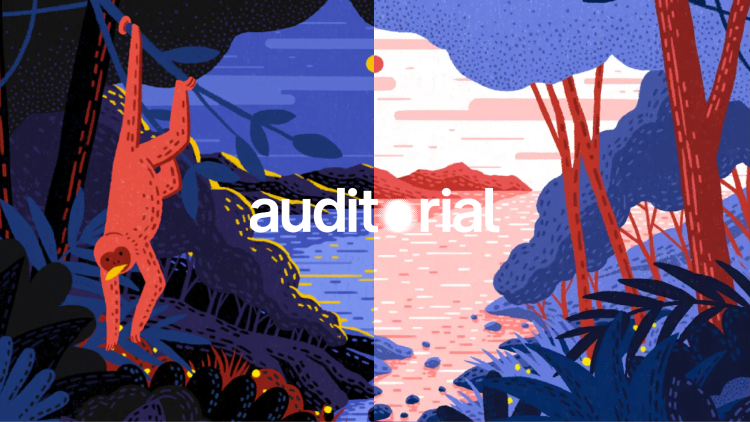
In a recent collaboration with the RNIB and The Guardian, R/GA set out to create an editorial experience optimised for accessibility. The result was Auditorial, an experience that can be configured in 22 different ways: everything from changing font size, or colour combinations to suit photo-sensitive users, to audio versions for low vision users and video controls for motion-sensitive users. This isn’t to say each state was designed. Instead the experience highlights the power of a design system defined with adaptation in mind. The design system can simply optimise the experience to whatever a user needs through pre-defined properties.
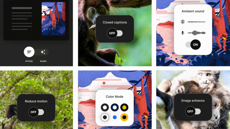
The Los Angeles County Registrar took a similar approach when redesigning their voting booths for the 2020 elections. A modular design approach meant that the interface could easily adapt text size, colour contrast, language, as well as have multimodal interaction – meaning it could be operated as an audio interface as well as visual. Feedback was overwhelmingly positive, proving an exercise in designing a voting system for disabled users, ultimately created a better experience for all users.
Questioning convenience
This broad approach to accessibility and thinking about the need to adapt to variable needs is more critical than ever as products and services are born, raised and sunset within a purely digital world. So much of our ‘culture of convenience’ that we rely on cannot be accessed by any other means than digital.
But, if you believe the culture of convenience is for everyone, try closing your eyes and booking a flight on your go-to travel site using only a screen reader. Or try navigating your favourite e-commerce site using only a keyboard. I promise you that the convenience that so many of us enjoy and take for granted quickly fades. This is the daily experience of so many of the 1 billion people included in the WHO estimate.
Accessible design isn’t something to be left to a checklist at the end of a design process. It also doesn’t mean memorising the WCAG by heart, but it does require a shift in mindset to design experiences inclusively from the start.
Three accessible design principles to keep in mind:
-
Look broadly:
Think about how diverse your audience will be, think about the different needs that they have to get to the outcome that you are envisioning. Analyse the problem from multiple perspectives to consider how you can build adaptability into the experience from the beginning. -
Look closely:
When designing the detail, scrutinise how each design decision will affect the experience for different forms of interaction. For example, is the copy in the button descriptive enough for screen readers? Will any text on images have sufficient contrast if the image changes in the future? Is there sufficient space to scale the interface? -
Look again:
Finally, and most importantly, accept your own bias and test your assumptions with a broad audience of ability. You’ll be surprised by the insights it can uncover and how much it can inspire the creative process.
By thinking about the adaptability of our experiences from the outset, and crafting them with diversity of need in mind, we can design a more accessible and ultimately better normal for everyone.
Design Week and R/GA collaborated on this recent talk which saw accesibility experts, designers and service users discuss how to design accessible experinces that everyone can enjoy.
-
Post a comment


