Koto on Glassdoor: identity reflects “radical transparency“ of company’s origin
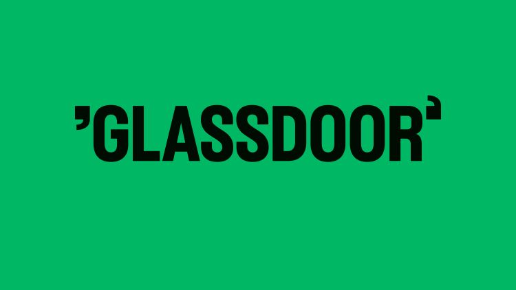
Glassdoor’s capitalised logo sits within a new g/d quotation mark monogram used as “a visual shorthand” across the identity.
Koto has rebranded job insight platform Glassdoor, with a strategy inspired by the company’s origin story and a “sophisticated but human approach” to illustration.
Speaking from Koto’s Los Angeles office, studio creative director Deanna German recalls how a few things stood out in the design brief, such as Glassdoor’s desire to shift the experience from being “a destination purely for insights and reviews into a community for real workplace talk”. Another goal was to better reflect one of the core company values: “radical transparency”, as the concept for Glassdoor came from an incident whereby employee salaries were left and found on a copier machine, according to German.

She explains how Koto used this story as inspiration for the strategic and verbal work by including “real conversations and insights as a part of the verbal tone”, as well as foregrounding transparency in its open design process. This invovled sharing its work “frequently and iteratively in internal and external forums”, such as Slack, Fishbowl, and the Glassdoor blog, and inviting feedback from the audience, German adds.
Koto commissioned Folch partner and creative director Josep Puy to create a suit of illustrations that would represent different job roles and new ways of working across the office and home. German reveals that the studio had followed Puy’s illustration work for a while and determined that his “sophisticated but human approach” aligned with the Glassdoor’s new strategy.
Puy aimed to illustrate “critical themes of conversation, diversity, anonymity, and collaboration through the lens of simplicity and honesty”, she says, adding that the illustrations appear in a black and white colour treatment.

German describes Glassdoor’s previous logo as “difficult to use in the product”. Its replacement was designed with the notion of “real work talk” in mind to life with the now-all-caps wordmark, with g and d-shaped quotations at either side. The move to all caps nods to “elongated door proportions” and the letterforms” swing open when animated”, continuing the theme.
Motion inspired by the product experience appears elsewhere in the identity, through behaviours such as typing, revealing, and scrolling.
Flipping the first quote mark to reveal a lowercase g “was one of those aha smile in the mind moments”, says German. The g/d monogram can also be used as “a visual shorthand that translates to the app icon” and other touchpoints throughout the system, she adds.
Custom emojis and icons mimic the wordmark’s elongated proportions, designed in favour of a “consistent and memorable product experience” with intentionally missing pixels seeking to represents “transparency and openness”, German explains.

Koto spotlighted the platform’s offering through an ownable data visualisation style to be used across product and marketing. The studio developed “a set of rules and principles to drive visual consistency” as well as outlining “some clear content buckets for different types of data”, aiming to ensure that “a variation of content is represented”, says German.
Glassdoor’s beginnings also informed the brand palette. While Glassdoor has traditionally been a green brand, Koto wanted to build on this, finding “the right shade of green that was AAA compliant [the highest level of Web Content Accesibility]” and devising “a set of complementary greens to support the product experience”, says German. A set of secondary colours, inspired by standard office copier papers, look to convey the “diverse voices of the Glassdoor community”, she adds.
-
Post a comment


