Non-linguistic place brand developed for Denver neighbourhood Sun Valley
The iconographic system takes inspiration from textiles, basket patterns and tilework across the Hispanic community.
Colorado-based design agency Wunder Werkz has developed an identity for Denver, US neighbourhood Sun Valley, with non-linguistic icons that can be understood by all its inhabitants.
In 1925, a zoning law turned the area into an industrial zone, leaving behind immigrant Hispanic families who were effectively redlined, beginning a period which has seen the community marginalised. Research in 2010 revealed that nearly 80% of Sun Valley residents live below the poverty line.

In a bid to regenerate Sun Valley and attract residents back to the area, the Denver Housing Authority (DHA) has started a project that aims to rehouse current residents in new properties mixing subsidised housing with market rate units. It also involves adding parks, gardens, job training centres, markets and other public amenities.
Wunder Werkz owner Jon Hartman believes that “thoughtful design should be accessible for all and that it shouldn’t be an afterthought in any community”, and so the Sun Valley community was heavily involved in the project. Ensuring that people understood “design decisions” was one of the challenges, says Hartman. Despite this, he thinks that “working with the community” and making the process “really transparent” resulted in a better outcome.
Since the neighbourhood has 29 different languages, with English as a second language for many residents, Wunder Werkz designed a non-linguistic system in the form of iconographic tiles to support the wordmark. The wordmark draws inspiration from “hand-painted signage”, resulting in “a bold and rounded form that is both easily readable and approachable”, says Hartman. He explains how it was constructed on “a similar ratio grid to the icons themselves”, providing consistency in application and layout across the identity.
Starting with the idea of “community as a tapestry or mosaic” and looking at everything from textile and basket patterns to tilework across the community for aesthetic inspiration, Hartman says Wunder Werkz devised a suite of “sturdy and artistic” icons. The studio sought to make the icons as “recognisable and functional” as possible, testing different weights and styles until it found something “unique enough to be worthy of the community”, he adds.
The icons have been grouped into five categories: Culture, Heritage, Nature, Community, and Structure/Architecture. Hartman describes the first two categories as “more aesthetic in nature” as they take influence from historic cultural groups’ flags and art, whereas the latter three include icons that are directly related to site features and amenities and are used primarily for wayfinding. Each icon was constructed on a 14×14 grid, so that new icons can be easily added over time as the community and its amenities grows.

Sun Valley is a remote community set within a vast rural area and its asphalt pavements make it prone to the urban heatwell effect, which is when a city experiences much warmer temperatures than nearby rural areas. To counter this, Wunder Werkz has suggested using light-coloured art to reflect heat as well as creating “moments of levity and aesthetic density” inspired by heritage patterns and textiles, says Hartman.

The studio also created a monument sign for the community. Hartman describes it as “eye-catching” but not “overly slick or corporate”, as the studio employed rammed earth methods so it could reuse some of the site soil that would be removed during construction. “Tonal and contrast combinations” feature in the colour palette, which seek to illustrate “the vibrancy of the community without being too complicated”, says Hartman.

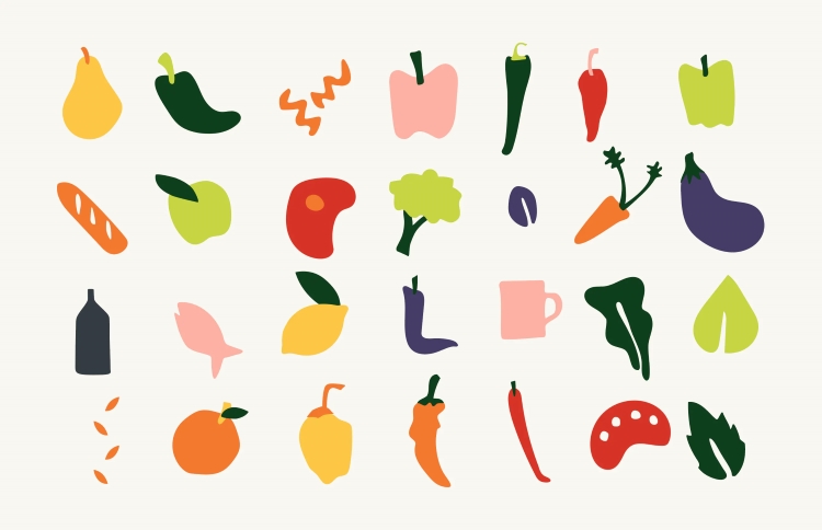
Prior to its redevelopment, Sun Valley was a food desert, which is defined as an area that has limited access to affordable and nutritious food. Wunder Werkz collaborated with DHA to design a market concept, creating the visual identity, signage and online presence for the project.
“The DHA wanted to ensure that there was a source of healthy food within the community but that also the various tastes and ingredients could be reflected there”, says Hartman. He explains how the studio constructed “a playful illustrative system” and a custom font called Neighbuor Sans for the market, as well as “a dynamic and enjoyable web presence that could speak to the community and the broader Denver market”.
-
Post a comment


