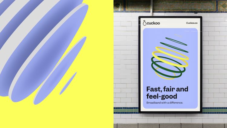
Broadband provider Cuckoo aims to ruffle feathers with new branding
Studio Output hoped to inject “an element of fun” into Cuckoo’s new look, setting it apart from other broadband companies.
Broadband start-up Cuckoo has revealed a new brand identity which is part of its attempt to relaunch as an industry contender.
London-based studio Output carried out the rebrand and focussed heavily on conveying a positive customer experience.
Cuckoo launched in July 2020, with the hope of providing broadband across the UK. It contributes 1% of its customers’ bills to spread internet to hard-to-reach communities around the world.

According to Output creative director and partner Johanna Drewe, Cuckoo’s branding is “a unique experience” that differs from the “tired, safe and corporate” look of other broadband companies. “The idea is to bring a sense of joy to what could be a boring task, so the design system has an element of fun,” she adds.
Drewe adds that the ultimate aim of the new branding is to “bring the spirit of Cuckoo’s vision, and the commitment of its people, to life through its brand and digital experience”.

The design team drew from some aspects of the original branding, which was done by Cuckoo co-founder and now VP of product Tommy Toner.
Output design director Mark Robbins says that the brand name and egg were used as a starting point. “We always aim to create distinctive assets that make a brand famous,” he says, adding that the name and egg provided “lots of potential for assets they could justifiably own”.
The egg shape is used more literally in the “3D adaptive worlds that are used to bring customer benefits to life” as well as in the 2D illustrations for Cuckoo instruction guides, according to Robbins.

Properties of an egg are also used more subtly to characterize “motion principles” and “memorable behaviours” across the digital experience, he says. They are also found in the oval qualities of Cuckoo’s typeface.
Output chose the Garnett typeface from Sharp Type, which Robbins describes as “a versatile, modern grotesk that renders beautifully at all sizes”. Its characters are meant to fit comfortably within the egg-based system without compromising legibility.

The wordmark was also updated using CoType’s Ambit typeface which was customised for certain characters. For example, a curve was added to the k, hinting at a beak.
Robbins explains how Cuckoo’s primary yellow colour was also retained with some slight tweaks. Now supported by a broader palette of light pastel and neutral colours, the refreshed look aims to “to inject vibrancy without overpowering the audience”, says Robbins.

The “fresher” and “punchier” hues are meant to differentiate the brand from other like it in the “corporate-looking sector”, says Robbins.
Cuckoo’s new branding will roll out from today across its website, customer comms and social media.
-
Post a comment


